Problem Statement
CureJoy was looking to expand its user base to the USA. For that CureJoy needed an aesthetic and structure that resonated with the American public.
First Step
Comprehensive competitive analysis of popular health and wellness-related websites in the US market
Defining the challenge
The challenge was to give CureJoy a facelift without changing its structure. The CEO was very clear that it was imperative to keep CureJoy’s layout for business purpose as well as to keep the changes mostly cosmetic without the need to invest in a team of developers to code a whole of new fancy features or rearranging the implemented grid.
Key Points
Introducing “Featured experts” in an attempt to attract more and better contributors to the blog.
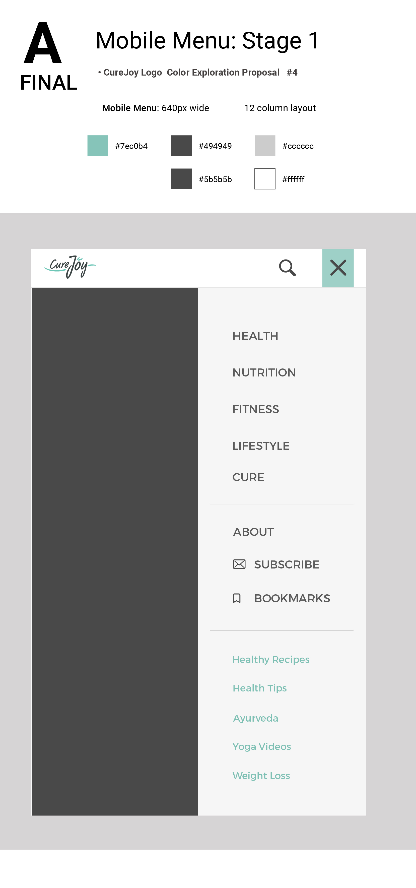
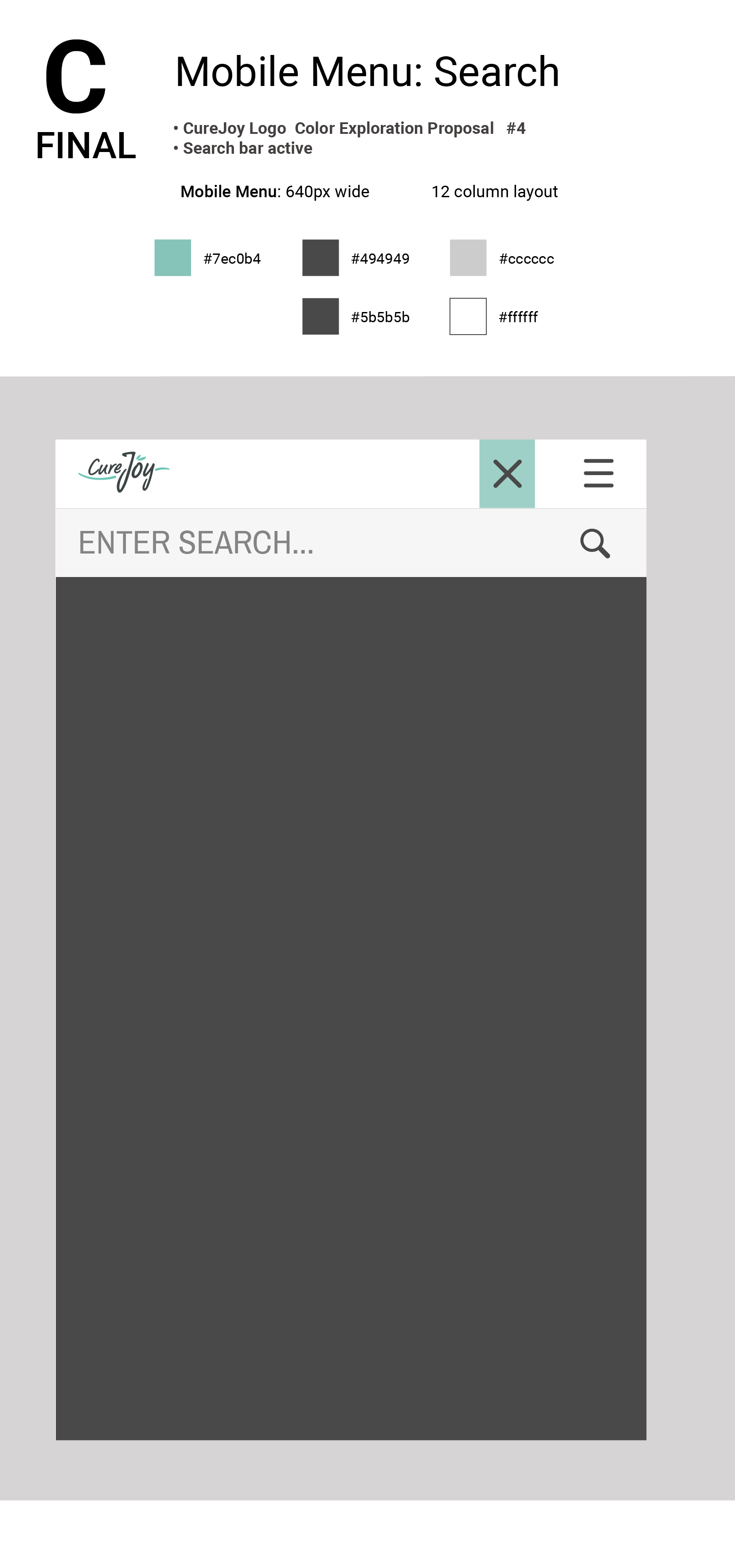
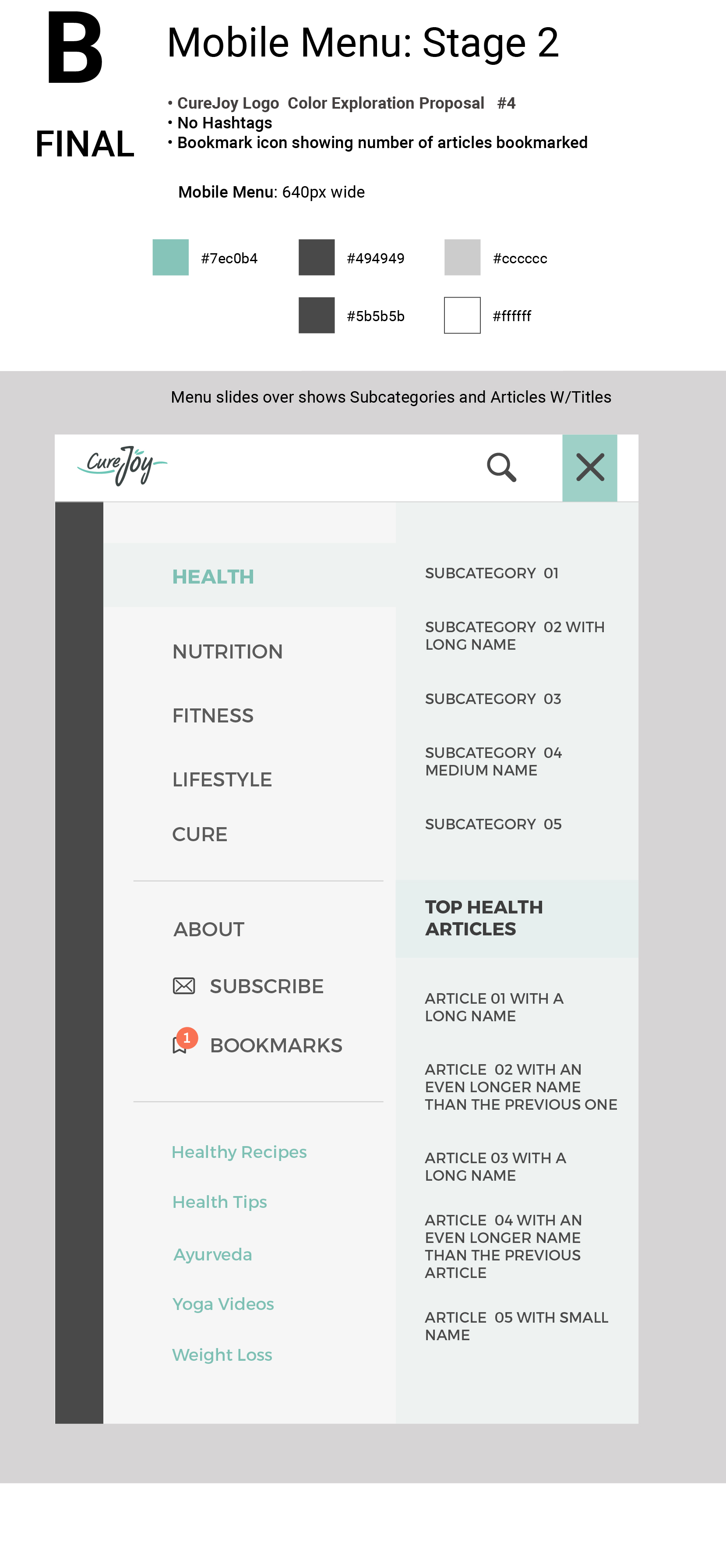
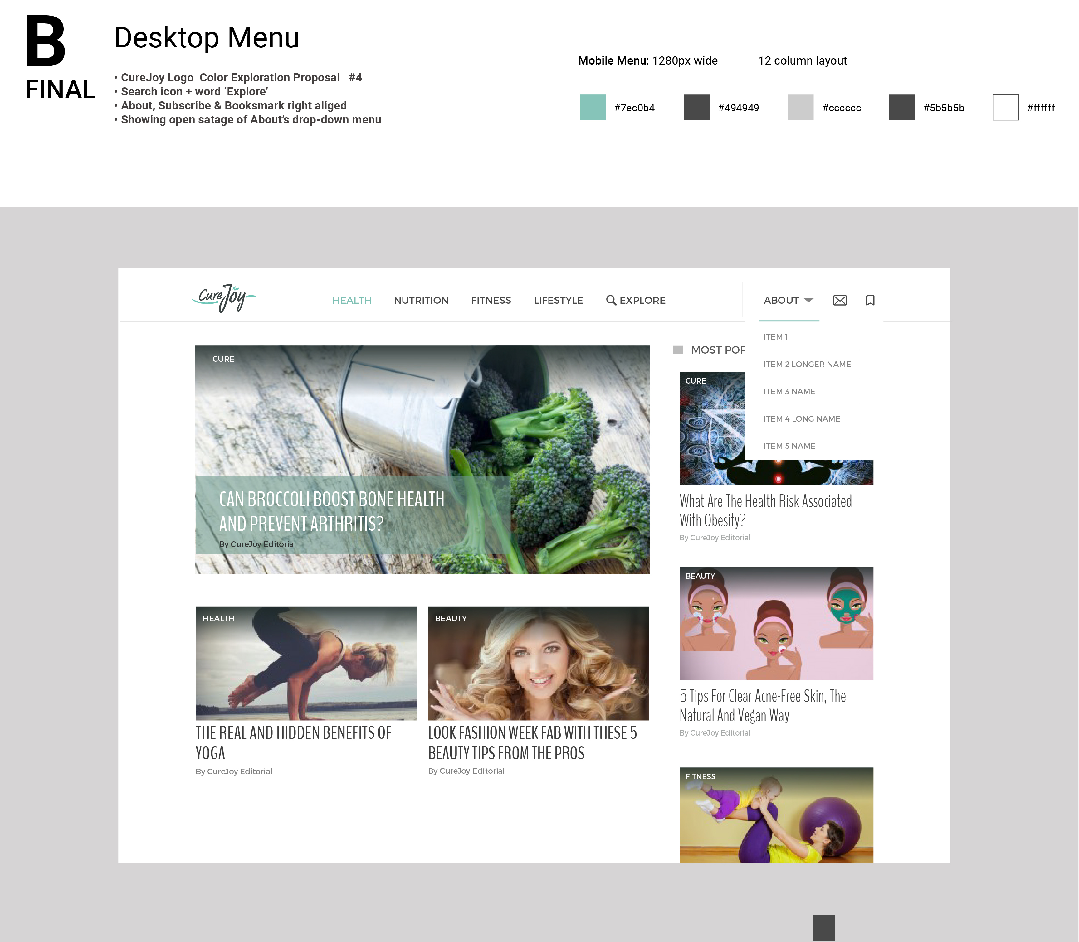
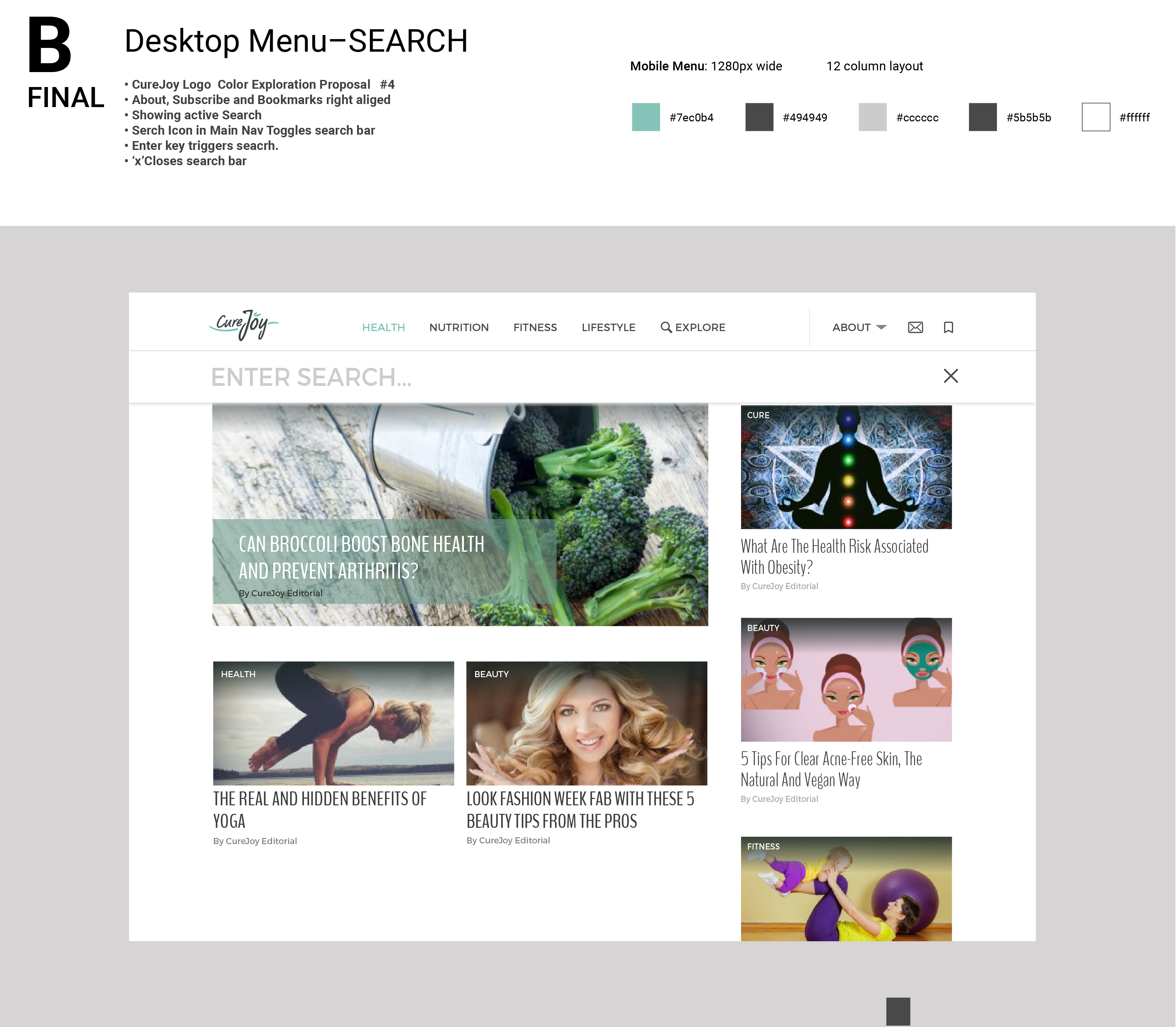
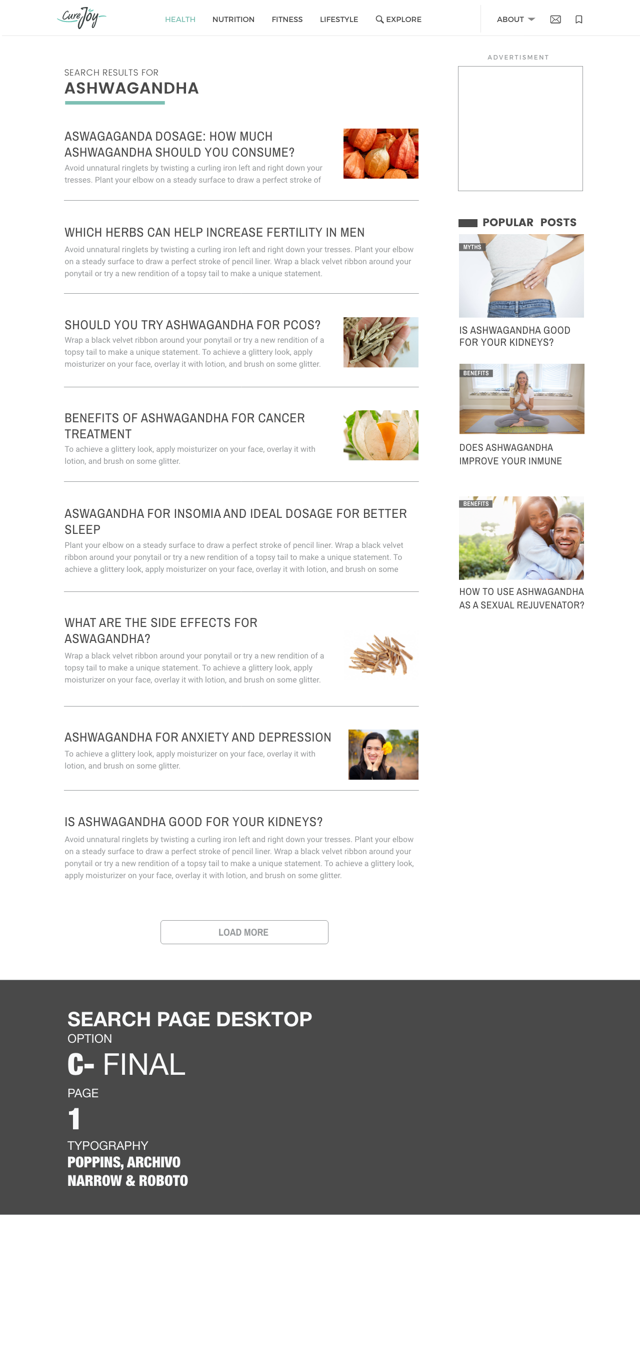
Design a whole new navigation for both mobile and desktop. Propose a cleaner, more organized and contemporary aesthetic to present the content.
Design Process
I worked closely with the CEO and the VP of Business Development to improve the look and feel of the product. In the early stages we started by improving and introducing small elements, one at a time, but by the end of my internship, we were redesigning complete pages including the navigation and pages that the CEO had envisioned to launch.
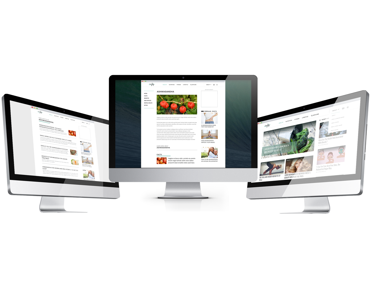
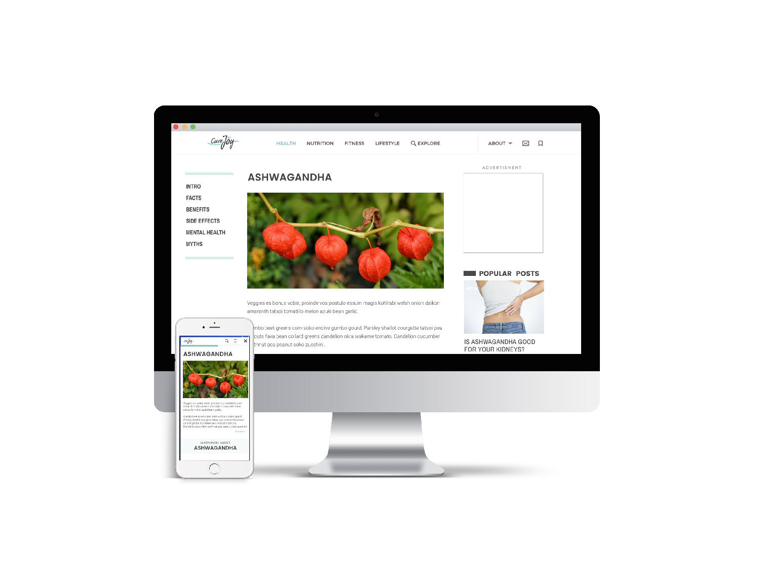
Desktop
High fidelity wireframes
Moible
High fidelity wireframes