FIRMSPACE
Problem Statement
Firmspace has a custom app that was designed with all the features, according to the stakeholders, the users needed to use and manage their offices. However, no prior user testing led the first version of the app to have a very low conversion rate. More than 50% of FIRMSPACE’s members were not using the app to manage their everyday needs within the space.
How we got to the solution
I arrived at the solution by hearing first the CEO, CTO, and Head of Product’s concerns about the app, as well as their vision for the app. I learned about the challenges that both the staff and users had to overcome since lauch.
Defining the challenge
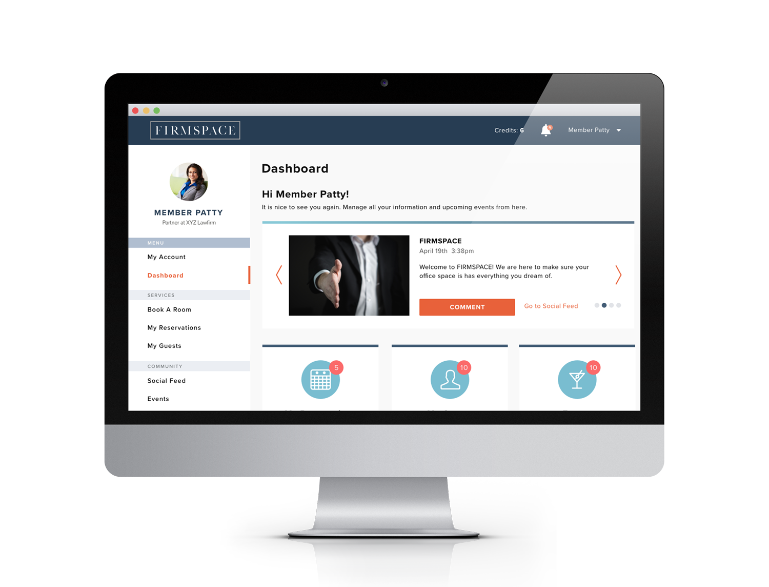
Our challenge is to simplify and improve every task flow starting with the user’s first contact with the app, the on-boarding process. The goal is to help every user finish setting up their account and start using FIRMSPACE’s app as part of their everyday office management tool.
Observation
Why were so many members not completing on-boarding? One of the problems was that the app failed to clearly identify that this first interaction with the app was the setup interface only and not the app itself. Many of the users did not know they hadn’t finished this process and therefore they didn’t have access the app’s core functionality (reserving conference rooms and registering guests). Many of the task flows did not clearly guide the user as to how to start or how to proceed in order to successfully reach their goal.
Another big problem I observed during my early exposure to the app were alarming error messages when a user entered unexpected information in a given field. This type of error message can scare users from proceeding to fix their information and in the worst cases, it prevents them from using the app altogether.
Hierarchy, labels, and color scheme on the app didn’t help to users to complete task flows, and therefore they were’t able to become self-sufficient in their executive workspace.
Ideation
Adjust the flows to achieve a better user experience while accommodating the stake holder’s needs.
Introducing a lighter color scheme that helped to enhance the experience.
Adding more labels and human-friendly language throughout the app.
Ultimate Goal
Allow the user to be self-sufficient with the app’s help. Allow the office manager to have a basic understanding of the technology and be able to solve all the users’ problems with the app. Have a scalable interface that will allow us to use the same app in all our current and future locations.
Personas

Terry Williams
Founder of Williams and Associates

Allison Wales
Office Manager
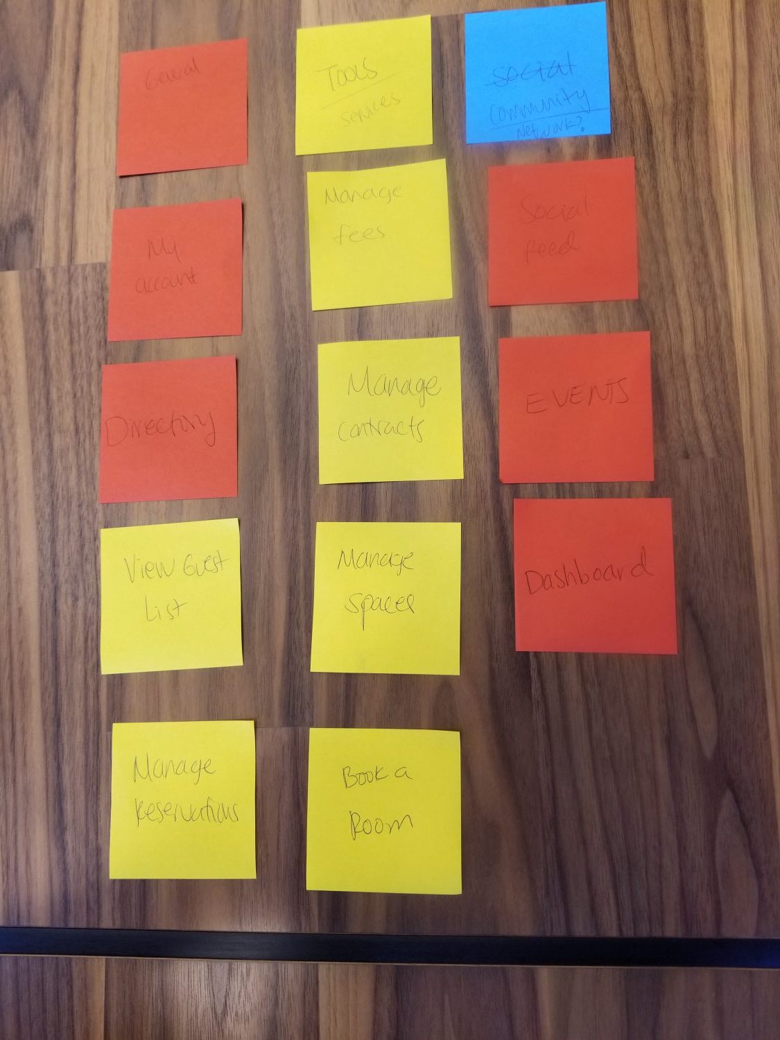
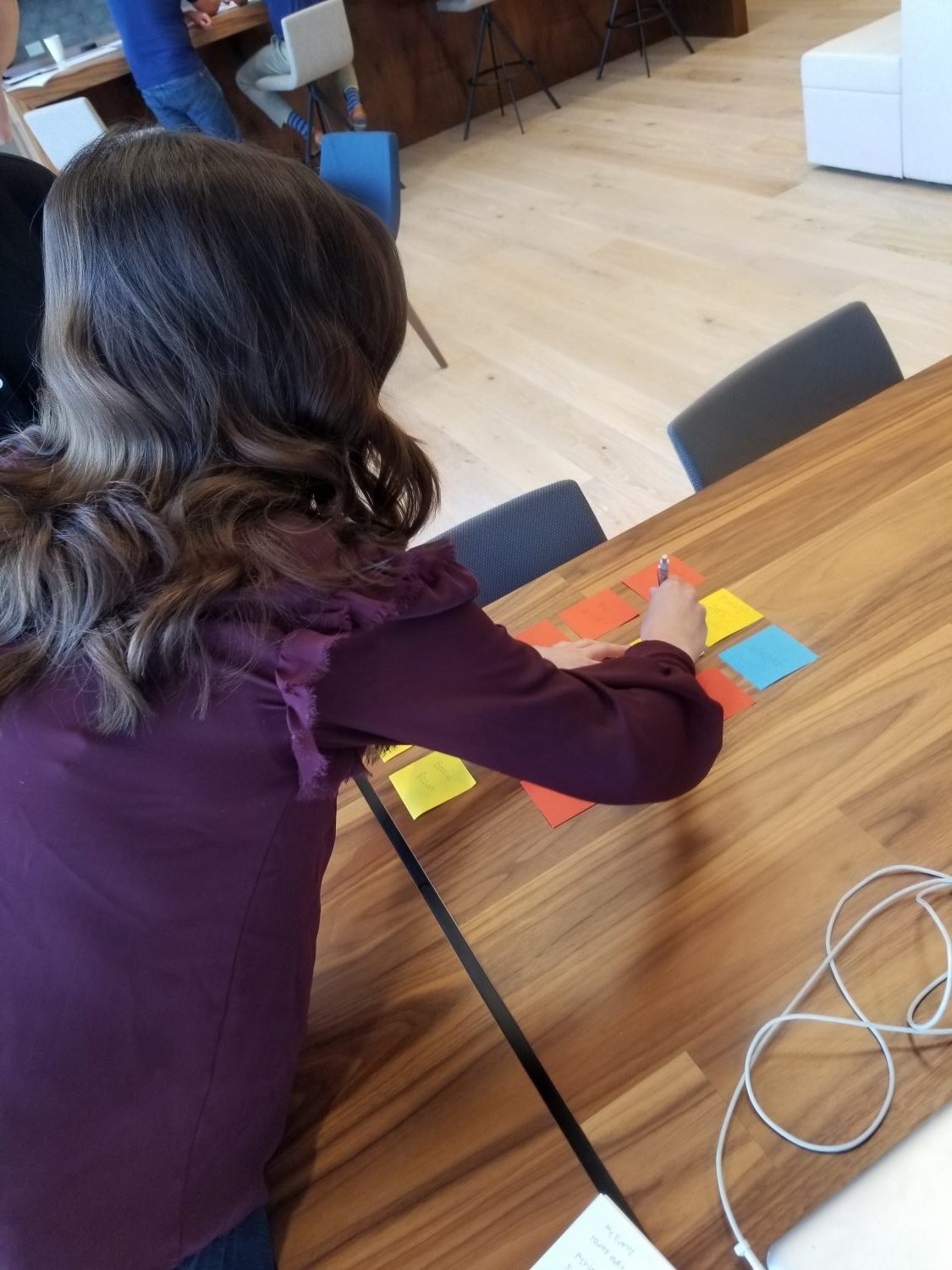
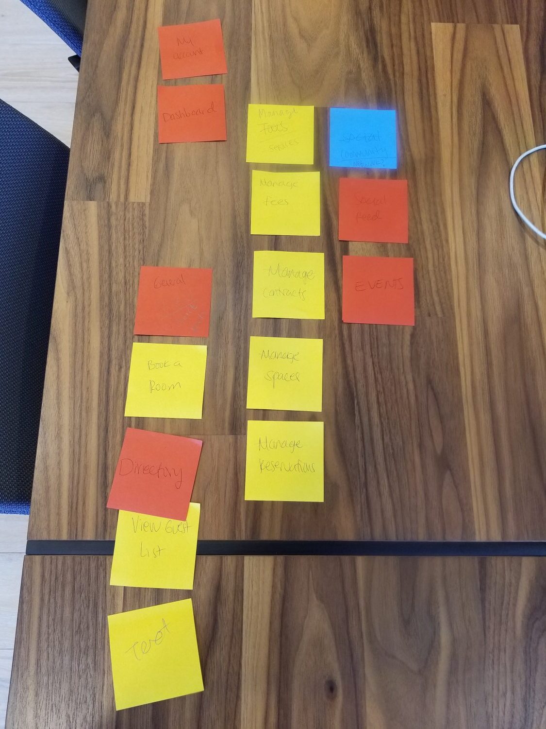
Early Sketches & Notes
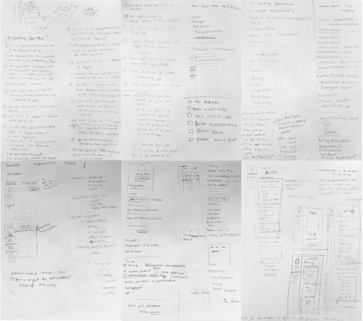
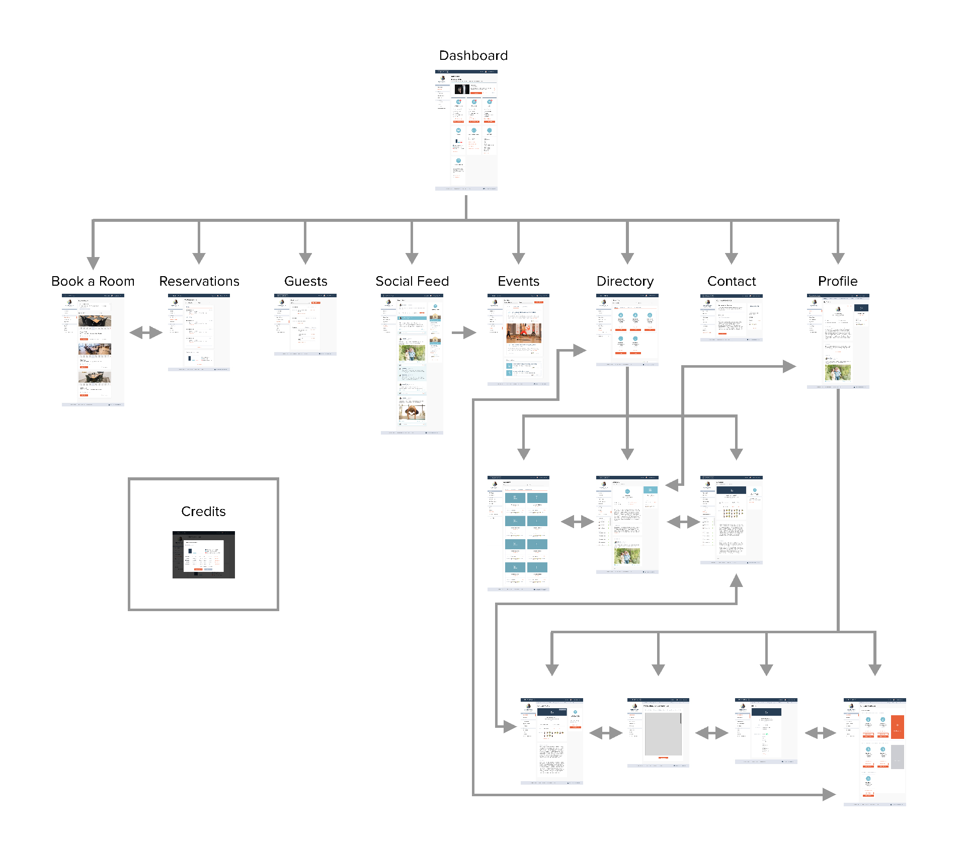
Flowchart
User Tasks
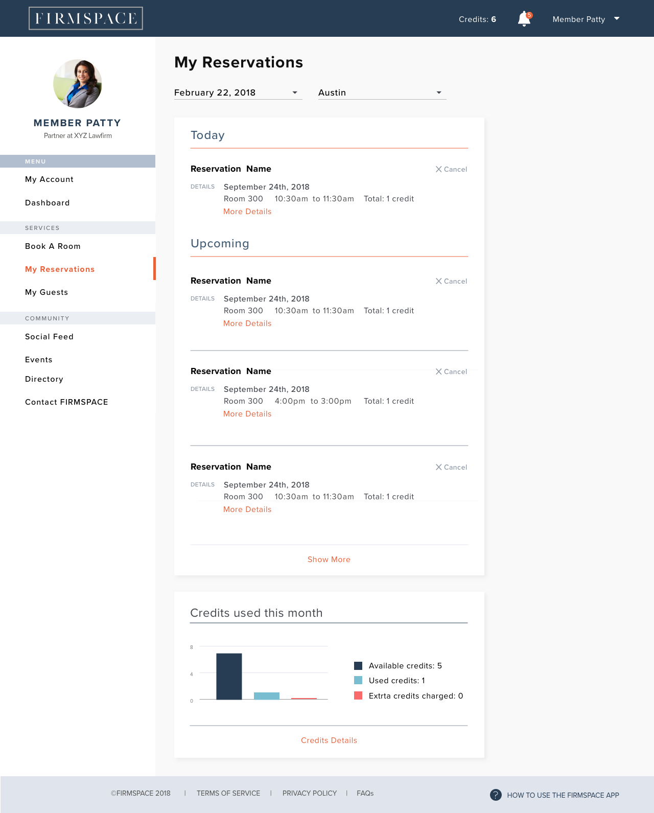
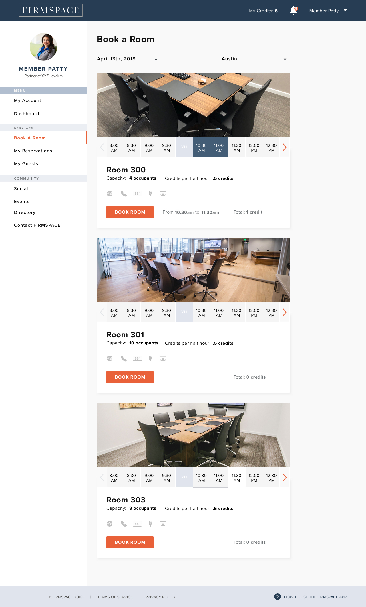
Book a Room flow
- The user clicks on ‘Book a Room’ from the side menu
- User arrives on the ‘Book a Room’ interface
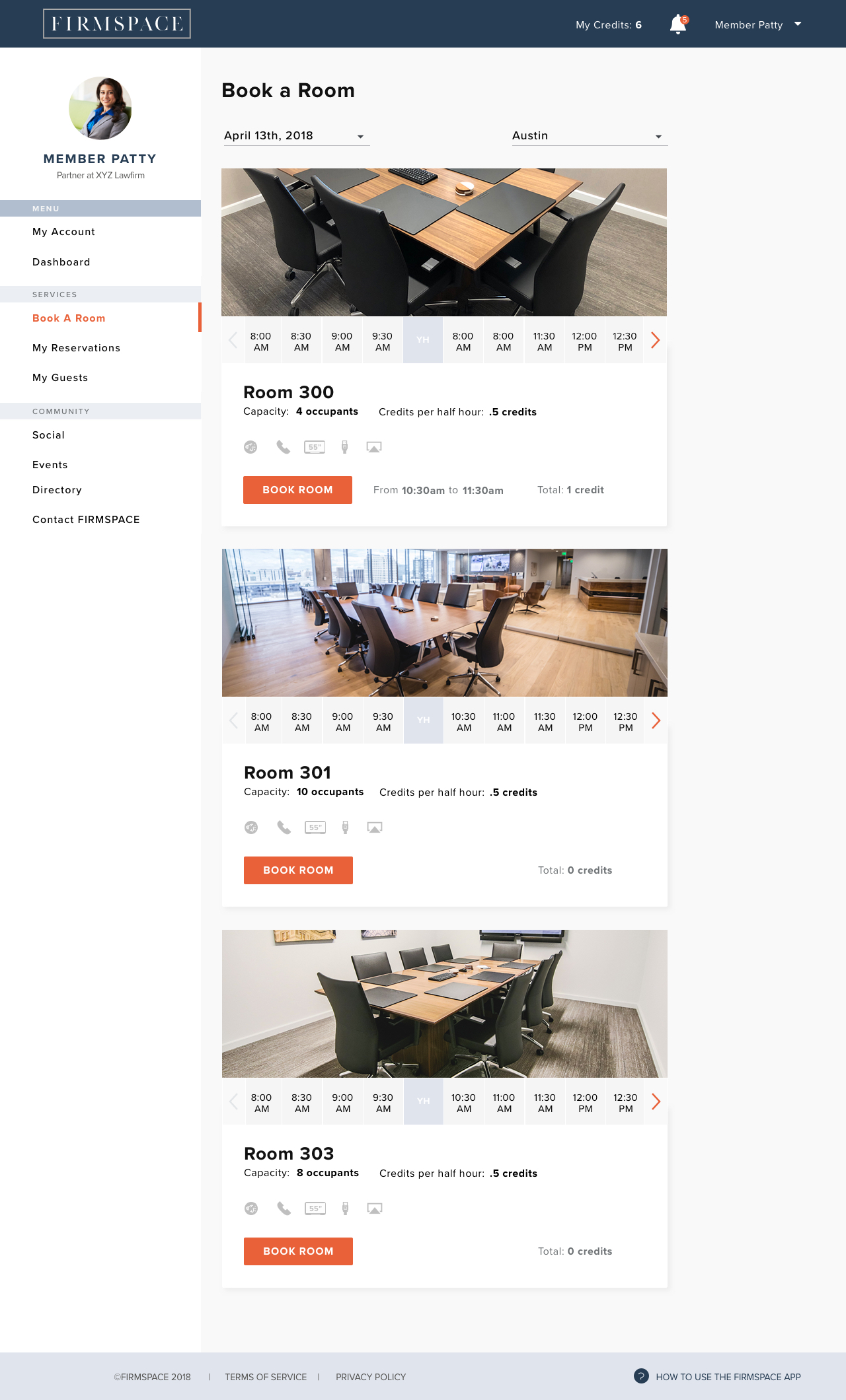
- User clicks on the date to select a different one
- User selects a date from the drop down calendar
- Date updates
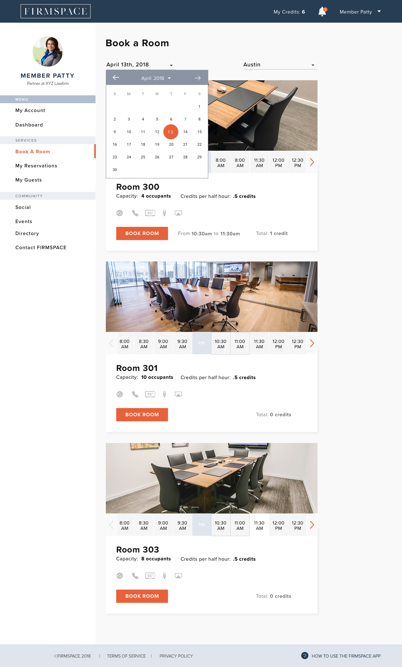
- User browses the available rooms on the selected day
- User reads the specification of each one and selects the one that meets his criteria
- User scrolls through the room’s time line using the left and right arrows to find the desired time slot
- User clicks on 10:30am and 11:00am to select the time frame
- User clicks on ‘Book Room’
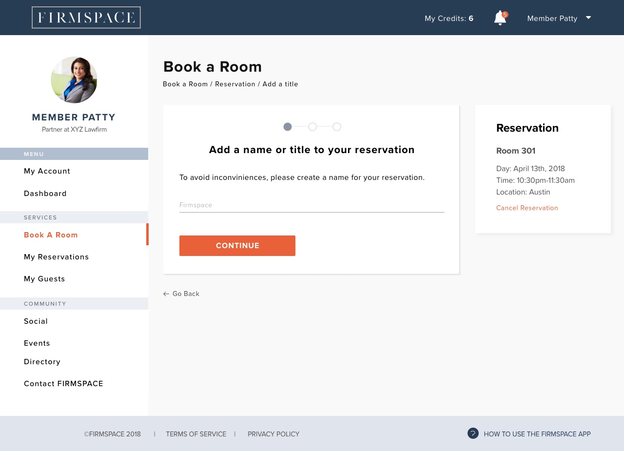
- User reads the instructions
- User types a name for his meeting
- User clicks on ‘Continue’
- User reads the instructions
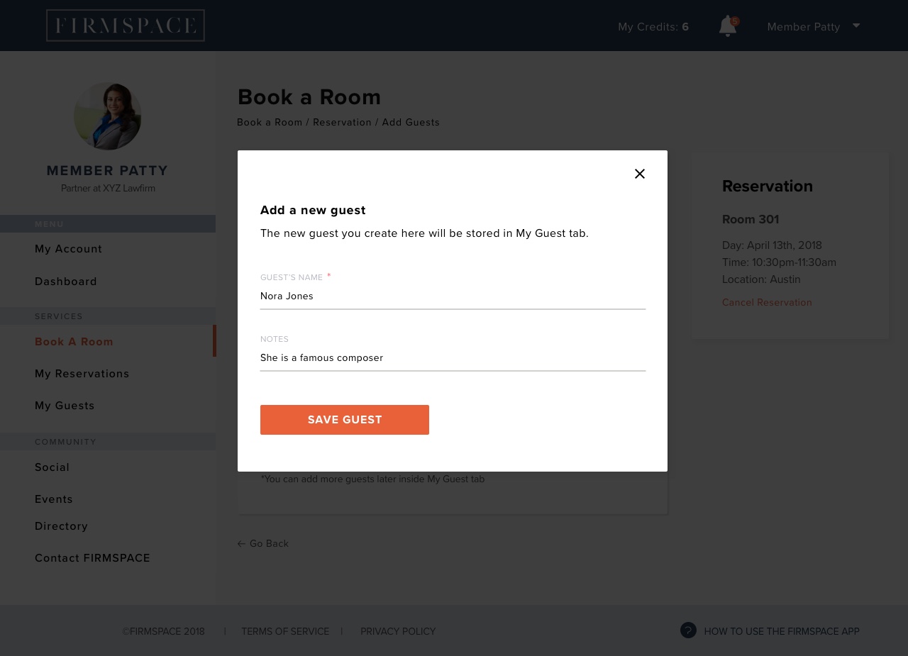
- User clicks on ‘Add new guest’
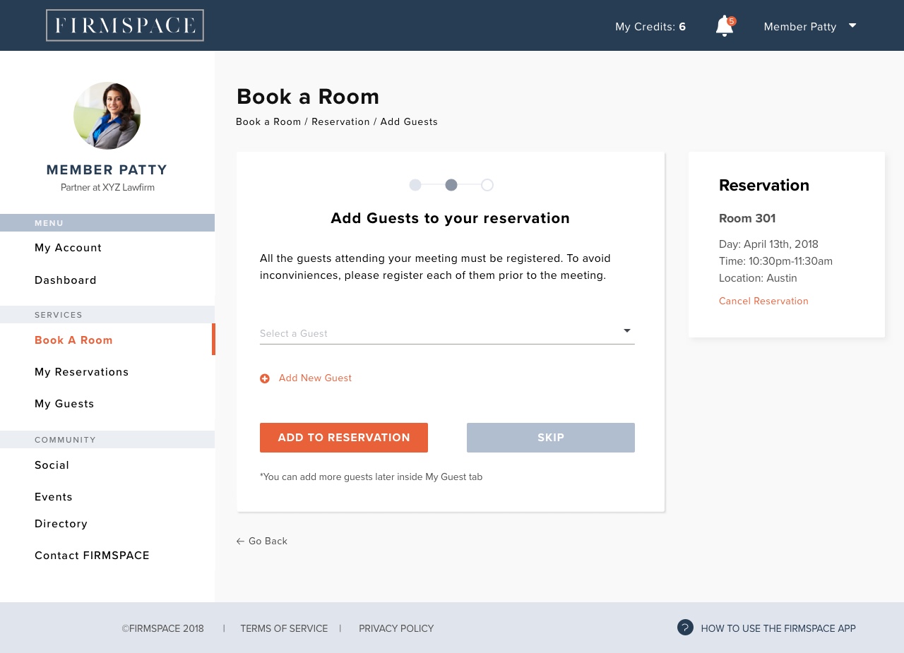
- User types the name of his guest on the form
- User types notes about the guest

- User clicks on ‘Save Guest’
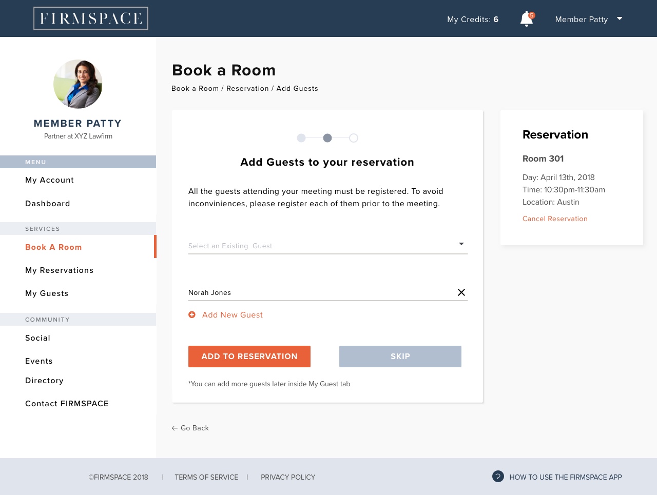
- User clicks on ‘Add to Reservation’
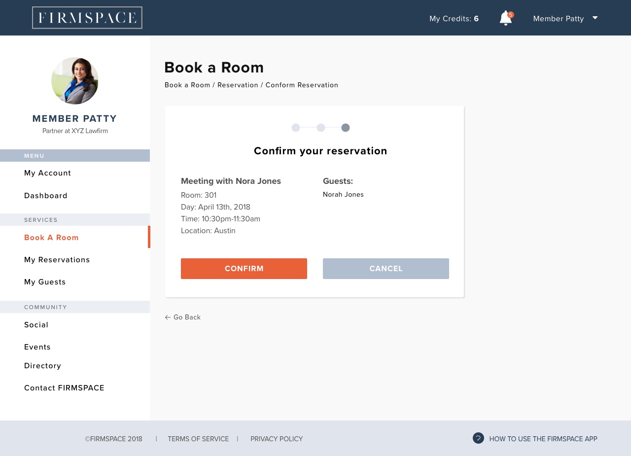
- User reviews the information about his reservation
- User clicks on ‘Confirm’
- User gets a success message
- User clicks on ‘Close’
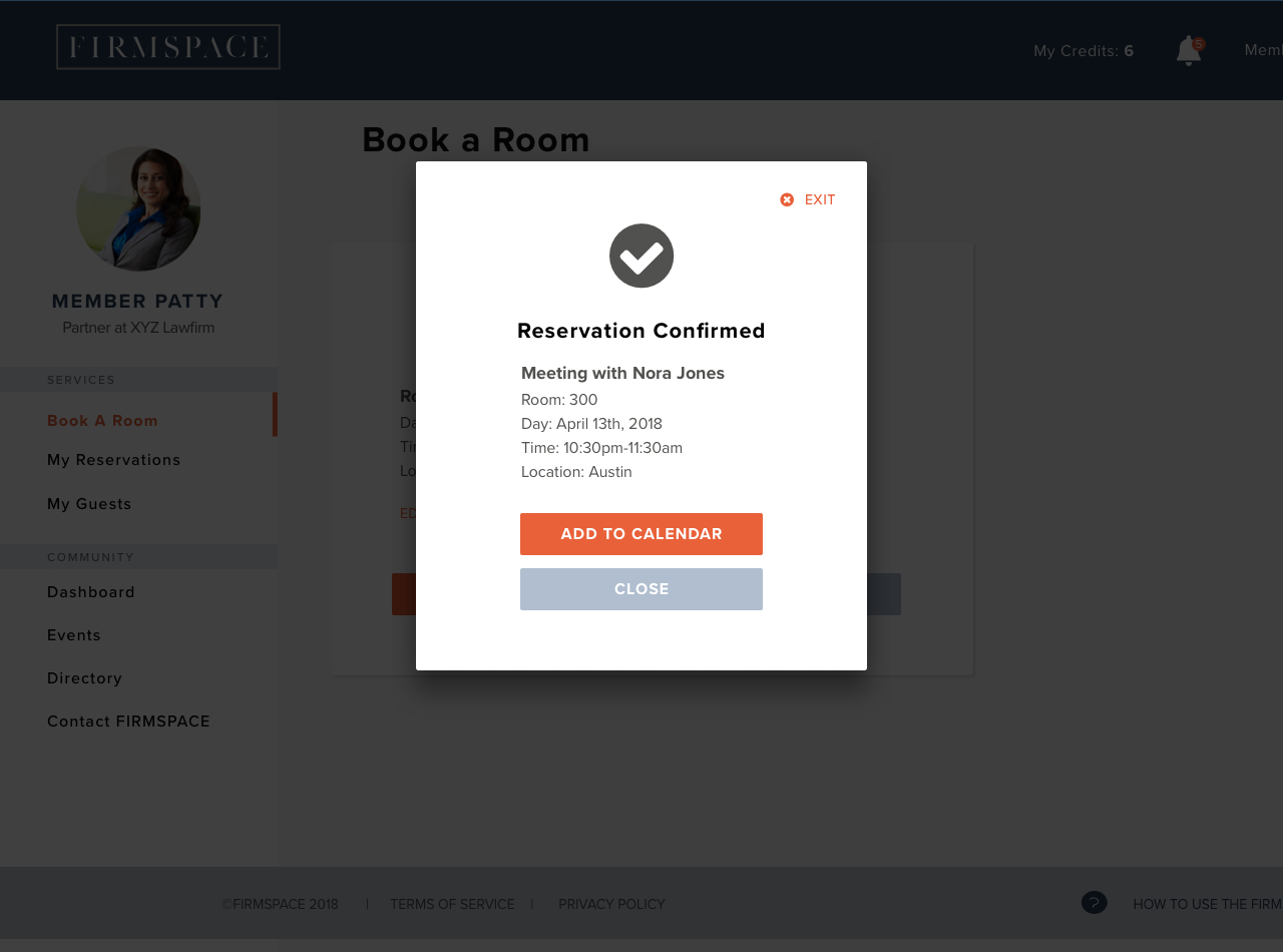
- User gets directed to the Reservations page
- User sees his Reservation scheduled