Volabit
Problem statement
The main problem we had to solve during the redesign was to accommodate one to two more cryptocurrencies, which Volabit expects to add to their portfolio in the near future, in a seamless manner and close to the original design. The goal was to maintain most of the flows intact in order to reduce the user learning curve while at the same time looking like a more solid and trustworthy version of itself.
The solution
The first step for us was to understand what our users were doing and how they were using our product. The second step was to predict what they would want from the product that they weren’t getting yet. Third step was to identify what was working well for our users and design around it.
The challenge
The challenge was to design for mistrusting and not necessarily tech-savvy first-time users, and for users that had gone through a steep learning curve when they first started using the service. That’s why staying close to the previous design, yet looking clean and professional was so important.
Key Points
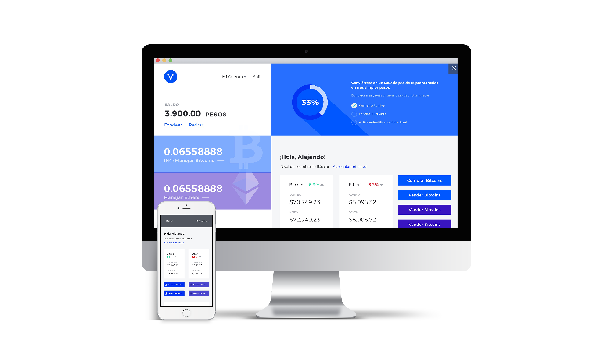
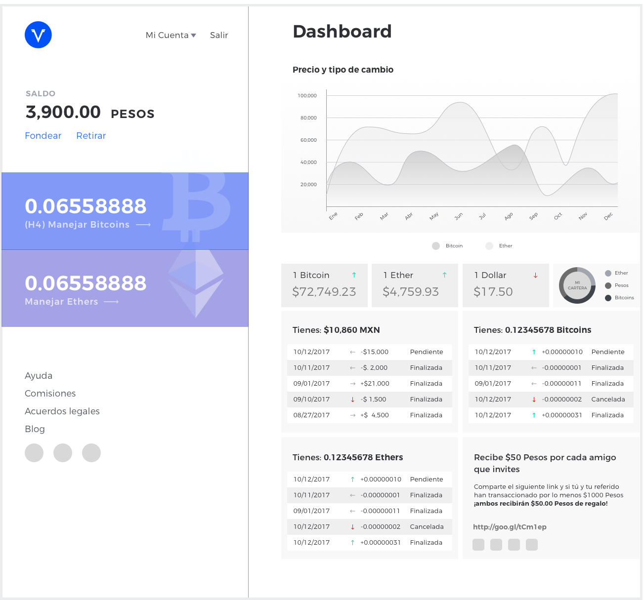
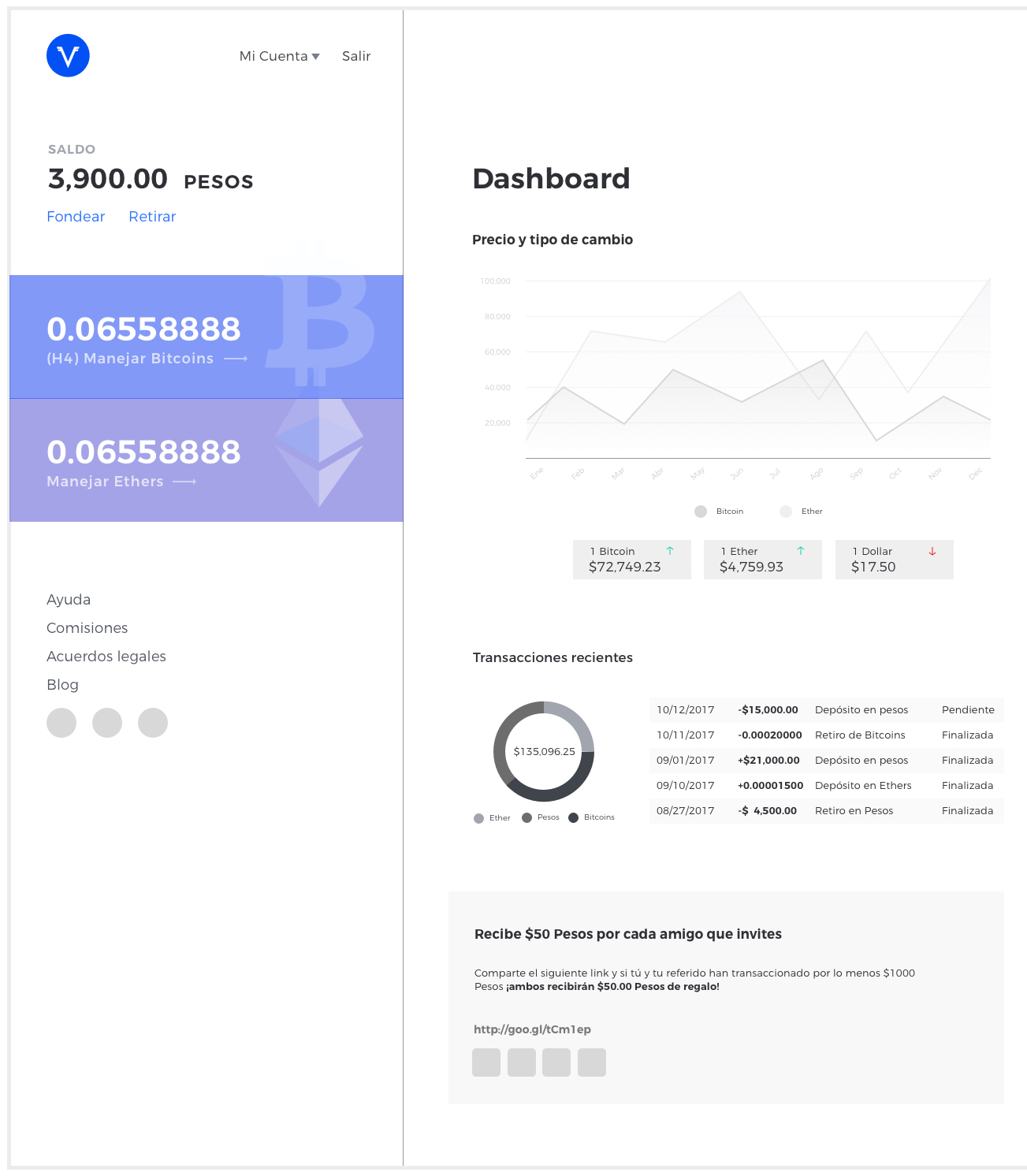
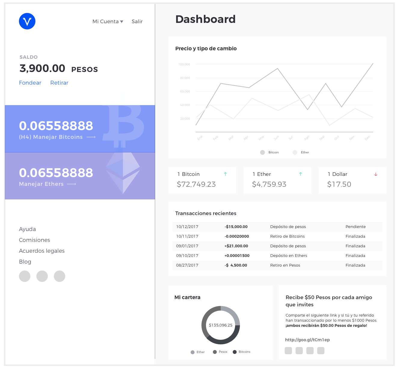
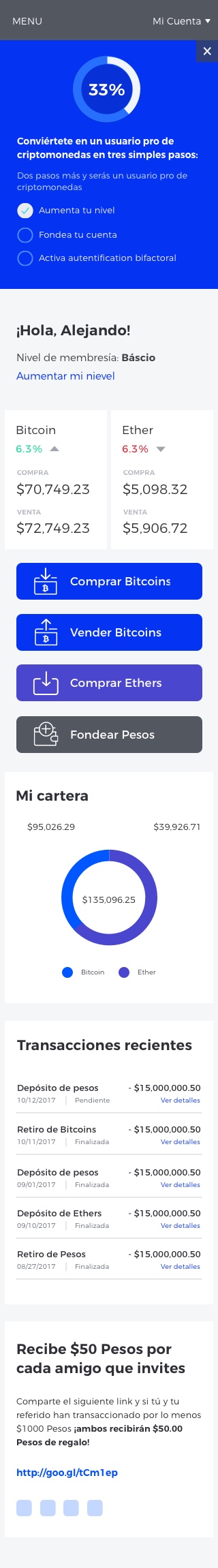
The previous dashboard was simply a menu. We needed to design a Dashboard where our users could overlook the most important aspects of their investment. A dynamic dashboard that enables the user to take the most desirable actions from one place while having an overview of their recent activity and the currencies performance. Our main goal was to create a website where the user felt more involved and triggered to invest and move their money.
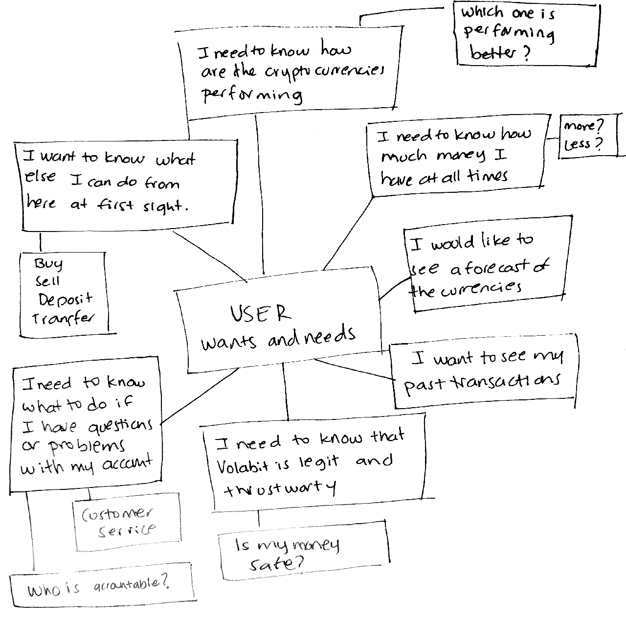
Observation
I joined the team after the redesign process had started, therefore things like identifying our target users and the scope of the work had been set. My first step was to absorb the proposed ideas and understand why those decisions had been taken. I studied the live app and identified the features and elements that were worth keeping and the flows that needed to be re-thought and improved. While identifying the features worth of having in our brand new Dashboard.
Ideation
The dashboard needed to be designed to engage the user to use all the features in our app. Take all the relevant pieces and arrange them in an appealing, organized and intuitive way. I took inspiration from banking online, diverse dashboards design from diverse financial and fitness websites and apps.
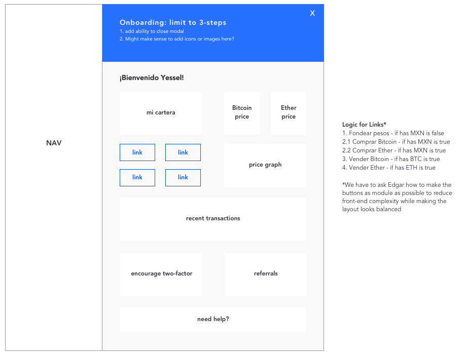
Rapid Prototyping
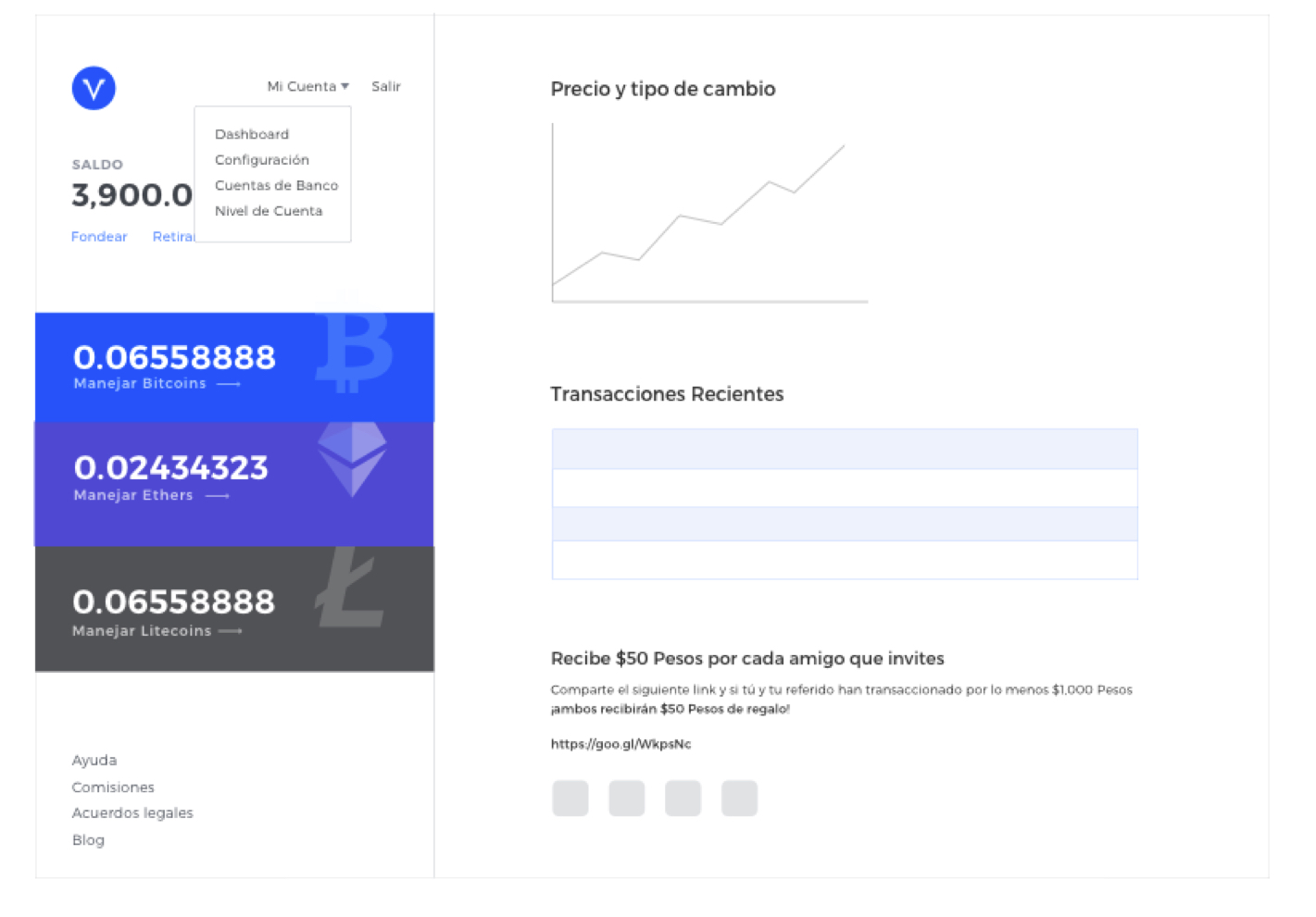
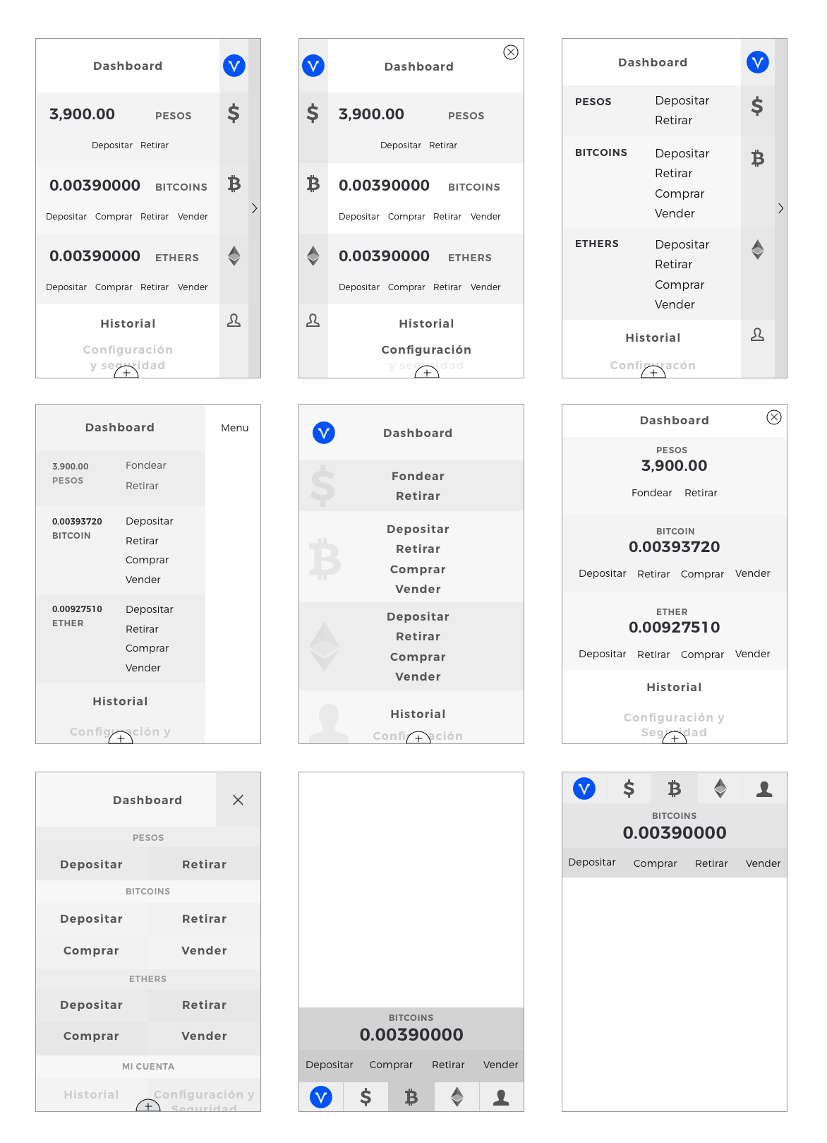
The COO provided me with a low fidelity wireframe of the general arrangement the dashboard would have and the final side navigation we’ll use. My job was to determine what features would be valuable for our users and its arrangement and hierarchy of the given elements in the dashboard. I studied the layout proposed and adjusted it to the dashboards and user’s needs. I ended up with a 10-column grid that accommodated the COO’s desire to have a vertical permanent navigation that took about 40% of our the real state. I used the reminder 6 columns to arrange all the elements in the dashboard.
Persona

Antonio Juarez
VP
Dashboard
Desktop
Mobile
Other improvements
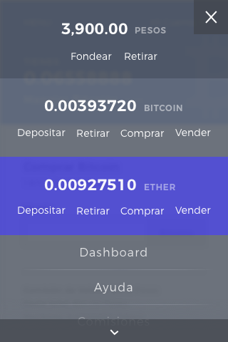
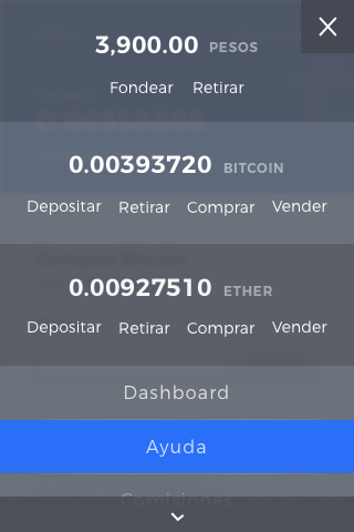
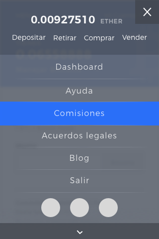
Mobile menu
Ideation
Final
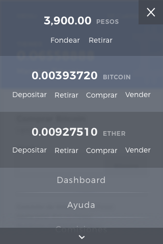
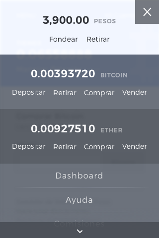
Mobile redesign
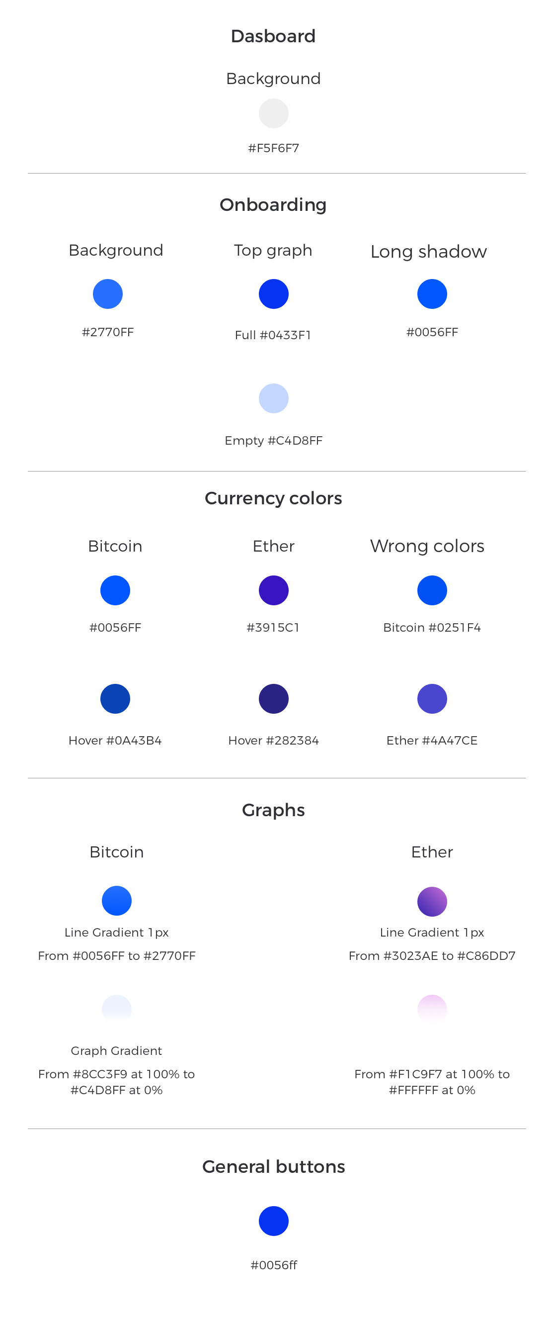
Colors adjustments
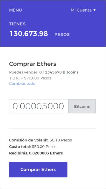
The goal was to differentiate the Bitcoin and Ether hues given that put side by side it was difficult to distinguish one from the other.