Legal E-Signature Platform
Mifiel Legal E-Signature
Mifiel is the only platform in Mexico that allows users to sign legal documents online with full legal binding — it combines blockchain technology with Mexico's FIEL (the government-issued advanced electronic signature) to produce contracts that carry the same legal weight as an autograph signature.
Products like DocuSign and HelloSign exist in Mexico but are not legally binding because paper contracts remain the default for any serious business agreement. Mifiel was asking users to trust a digital platform with their most sensitive documents, using a government-issued credential that many Mexicans associate with the SAT, Mexico's tax authority, and therefore approach with caution.
My work centered on two things: reducing the friction that was preventing early adopters from fully trusting the platform, and building out a suite of new features that made Mifiel genuinely useful for businesses operating at scale.
Mexico's technological adoption curve in professional settings is uneven. Many users — even at the business level — were encountering digital document workflows for the first time. The FIEL's connection to the SAT added a layer of institutional wariness that paper contracts don't carry.
Early adopters were abandoning flows before completing them. Technical friction in key moments — like reviewing documents, entering credentials, understanding what happened after signing — was being read as a signal that the platform wasn't safe. In an environment where trust is already fragile, a confusing UI is much more costly than it would be elsewhere.
Companies that had already integrated Mifiel's API needed features that didn't yet exist: signing multiple documents at once, sharing signed documents with third parties, flagging errors before signing, and converting one-time signers into permanent platform users. All these were blockers for scaling enterprise adoption.

Managing 24 people and tens of thousands of client contracts. Alberto understands the business case for digital signatures and is motivated to modernize his division's processes, but he needs a platform that will hold up against legal scrutiny and work reliably at volume.

From Mexico City, whose digital comfort zone stops at Facebook, email, and Google. Mario is business-savvy and motivated by efficiency, but the FIEL's connection to the SAT makes him nervous, and any moment of confusion in a flow reads as a red flag.

Digitally comfortable in her personal life but with limited exposure to professional digital workflows. She's not resistant to new processes, but she handles contracts frequently enough that any friction compounds fast.
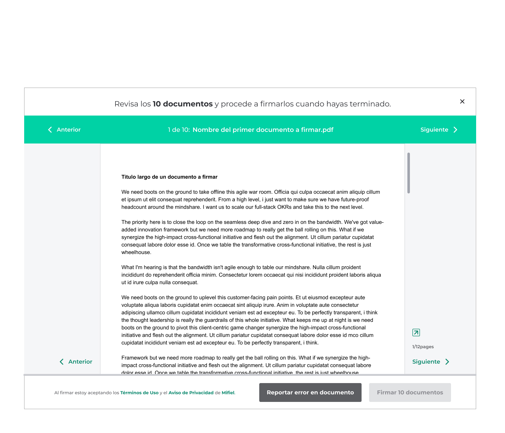
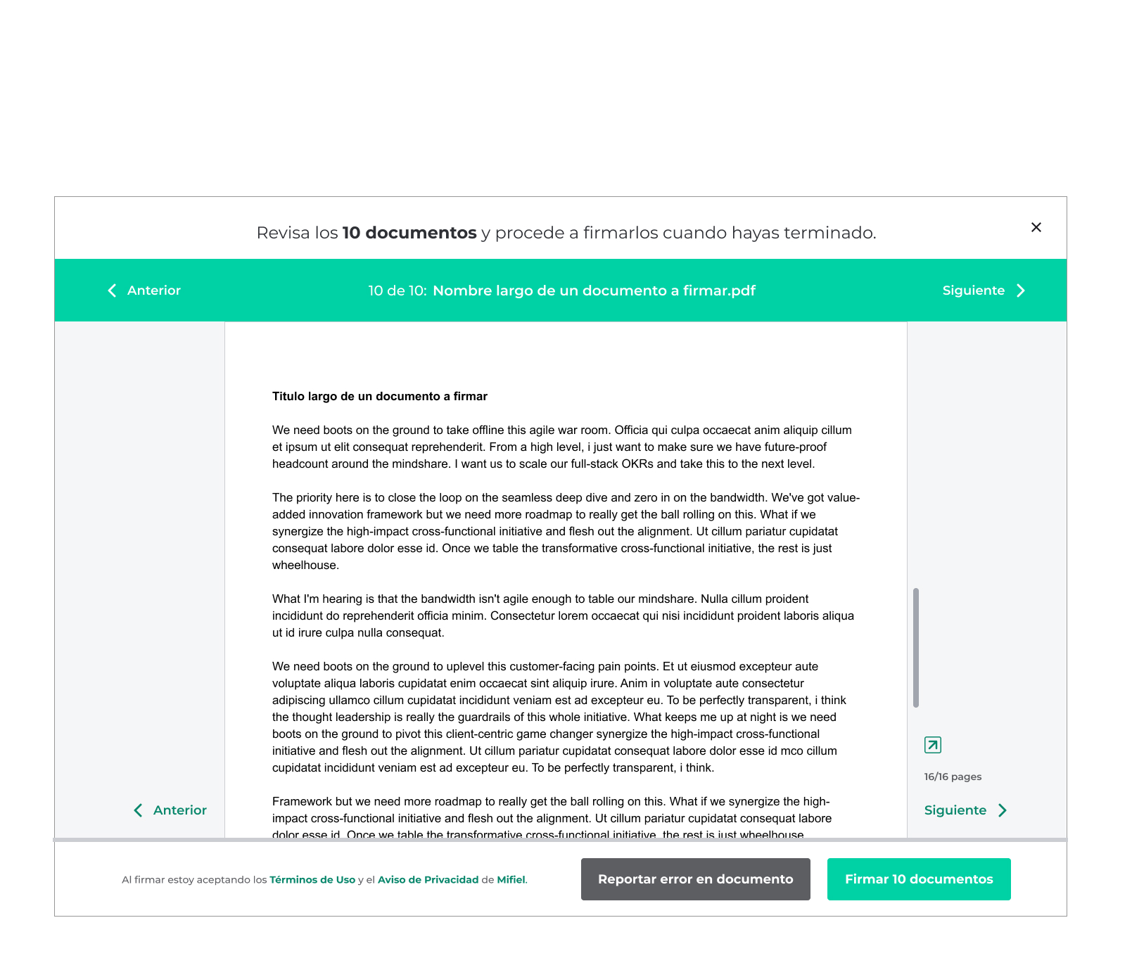
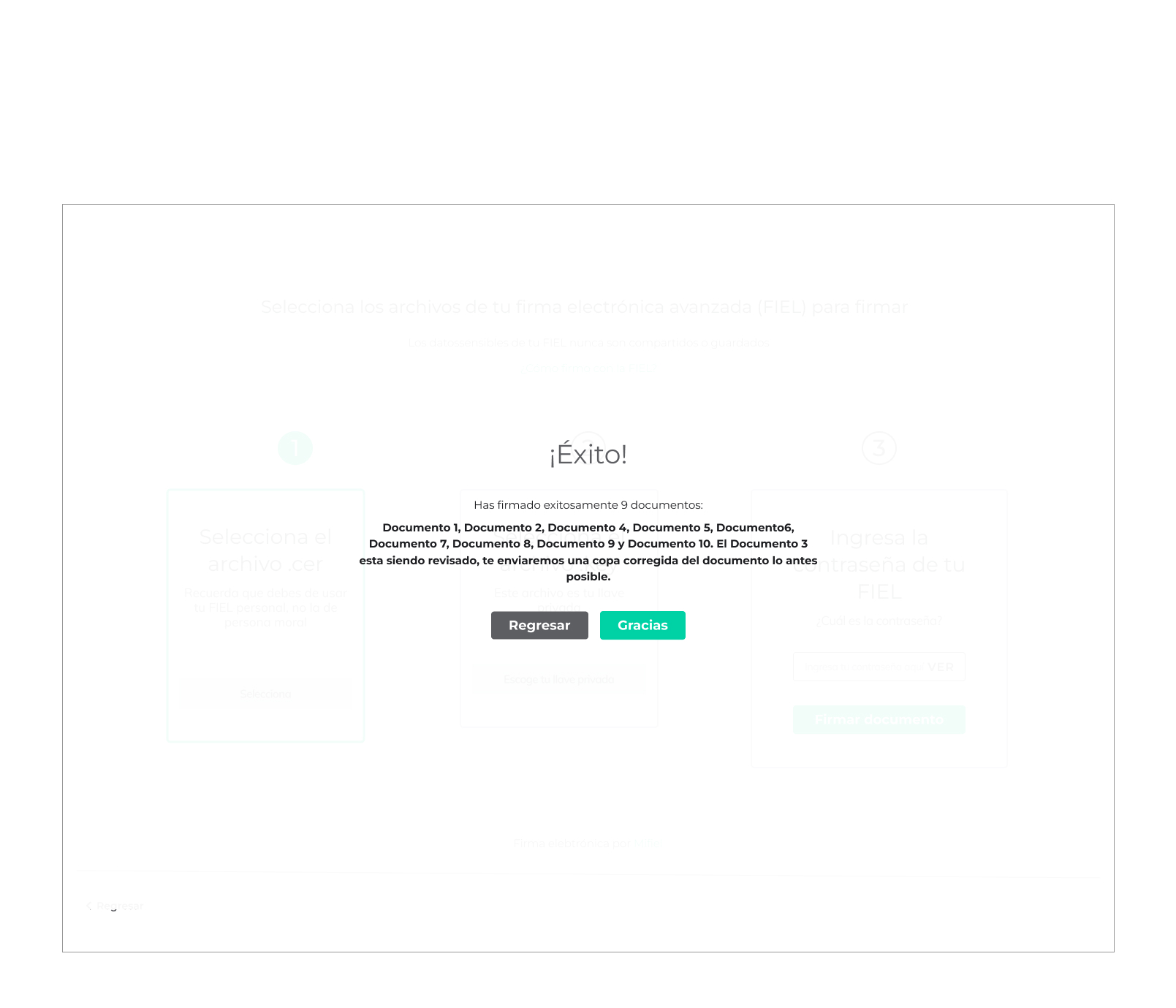
The highest-priority feature request from enterprise users. The challenge was designing a flow that made signing multiple documents feel manageable — not overwhelming — while ensuring users actually reviewed each document before committing their FIEL signature.
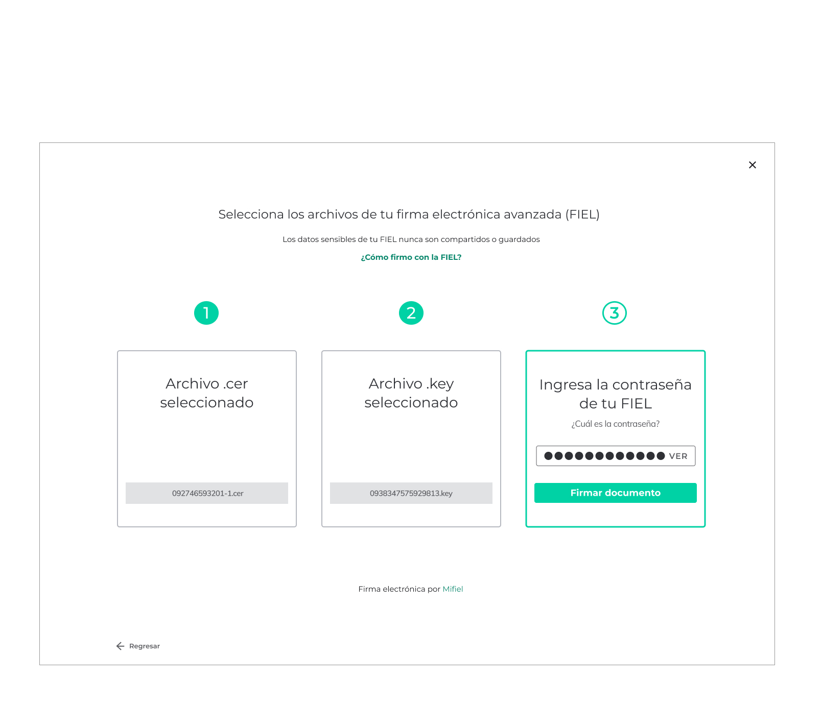
The flow prevents users from skipping review: attempting to sign before reviewing all documents triggers a notification explaining the requirement. Once all documents are reviewed, the signing interface mirrors the single-document experience — the same .cer and .key file upload, the same password entry — so muscle memory transfers immediately. A single action signs the entire stack.
Design principle: Familiarity at scale — the new capability shouldn't feel like a new product, just an extension of a workflow users already trusted.
After signing, users frequently needed to distribute the completed document to parties who weren't part of the signing process — clients, legal teams, filing contacts. This feature was absent from the original product.
The flow surfaces immediately after the success confirmation: a single prompt, a simple email input, a send action. The document goes; the user lands back in their document library. Nothing requires navigating away from the moment of completion.
Before this existed, a user who noticed an error in a document mid-review had no recourse inside the platform to fix it. They either signed anyway or abandoned the flow entirely.
Adding a clearly labeled 'Report a mistake' option, accessible from the document review screen, does more than solve a workflow problem. It signals that the platform trusts users to be accurate participants in the process, not just passive signers. For Mario — the user most cautious about committing his FIEL to anything uncertain — this feature changes the calculus. He can flag concerns and proceed with confidence, rather than abandoning because he felt powerless.
When a user signs a document through Mifiel without having an account, the post-signing success state becomes a conversion opportunity. The redesigned confirmation invites the user to create an account with a simple password setup and immediately gifts them three free documents.
The moment a user completes their first successful signing is the moment their trust in the platform is highest. That's when the invitation lands correctly — not as a sales pitch, but as a natural next step. The user lands in their new document library already seeing the document they just signed, plus three free credits. Value delivered before they've had a chance to second-guess the decision.
Before: the 'I'm ready to sign' button sat at the top of the document review screen, followed by a thick horizontal divider — a visual stop that implicitly told users their job was done. Many users never scrolled down to read the actual document before signing.
After: the button moved to the bottom right — the user's natural end of a reading flow. This eliminated the visual stop, removed the ambiguity about whether the document below was the contract or Mifiel's terms and conditions, and made the scroll bar discoverable as the cursor moved toward the button. I also added a PDF download link and 'Open in new window' at the top for users who prefer to review outside the browser.
Design principle: A layout that guides users through the document before they can sign it — by removing every blocker to skip the review.
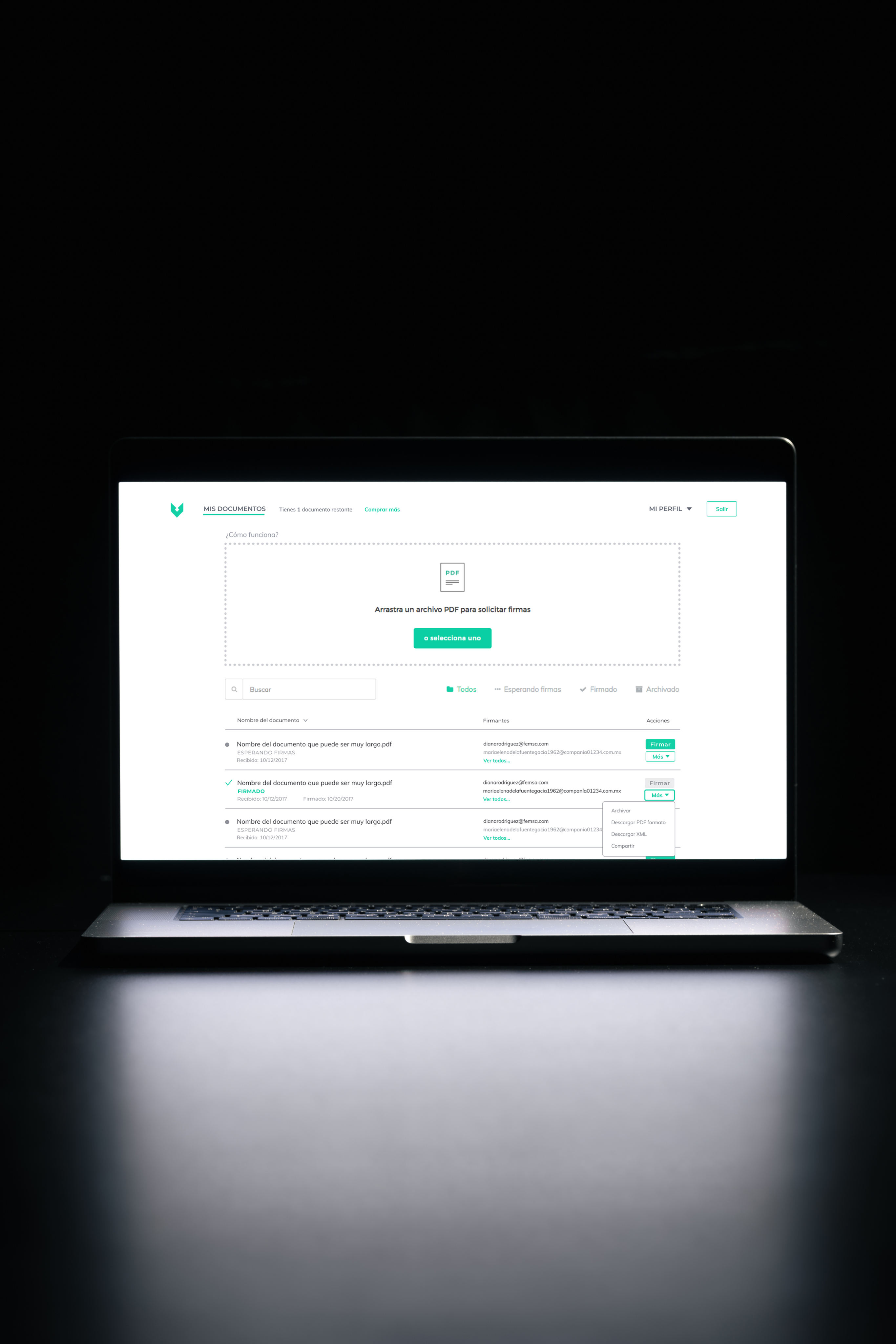
The original 'My Documents' table was functionally broken: fields and labels wrapping onto multiple lines, status indicators that were ambiguous, a 'Mas' (More) link that meant two different things depending on where it appeared.
The redesign established a clear hierarchy: document name anchors each row with status and key dates nested below; signed documents display a checkmark instead of an ambiguous green dot; signer email addresses are color-coded — gray for pending, black for completed; the 'Mas' (More) ambiguity was resolved with 'Ver todos…' (View all) for the signer list and a secondary green style for the options button; the Sign button disables after signing rather than disappearing.
Design principle: Make the most important information — what's signed, what's waiting, and who's involved — legible without opening a single document.
The Mifiel context made standard UX decisions carry unusual weight. In most products, a confusing UI costs you a conversion. In Mifiel, a confusing UI cost you a user's willingness to attach their government-issued credentials to a legal document — because it's a decision with lasting professional consequences if something went wrong.
That raised the bar on clarity. Every label, every confirmation state, every error message had to work for Alberto's legal team, Mario's cautious instincts, and Teresa's need for speed — without the benefit of assumed digital fluency.
Reducing friction always reduces risk. In Mifiel's context, they were never separate problems.
Every design decision — from where the sign button lives to whether a mistake can be reported — was ultimately a trust decision. Getting the UX right was not about polish. It was about making a legally consequential action feel safe enough to take.
I should've suggested alternative accessible colors. When I got to Mifiel the Head of Product had already worked on a design guideline that included all the permitted colors and their uses. In hindsight, I should've suggested accessible grays and alternatives to replace the teal brand color from CTAs and important information.