Trusted AI Platform
Cortex Certifai
The industry's first AI vulnerability detection and risk management platform.

Trusted AI Platform
The industry's first AI vulnerability detection and risk management platform.
The Results
Overview
In 2019, enterprise AI was hitting a wall. Organizations across banking, insurance, healthcare, and government had invested heavily in machine learning models and were struggling to deploy them at scale because neither their compliance teams, their regulators, nor their own leadership could understand or verify what those models were actually doing.
Cortex Certifai was CognitiveScale's answer: the industry's first AI vulnerability detection and risk management platform. It could probe any black-box model, without requiring access to its internals, and produce a quantified, auditable assessment of its trustworthiness across five dimensions: fairness, explainability, robustness, data rights, and compliance.
AI Trust Index
A FICO-like composite score designed to make opaque AI systems legible to the people responsible for deploying, auditing, and regulating them.
The Problem
Certifai's technical capability was genuinely novel: a genetic algorithm that generated counterfactuals to probe model behavior and score it across multiple trust dimensions, model-agnostic and applicable to any type of input data. But that capability was only valuable if the people who needed to act on it could actually understand what it was telling them.
Data Scientists
Technical granularity: model-level scores, delta comparisons against a baseline, scan-level details across multiple runs.
Compliance Officers
Audit trails and regulatory alignment: the ability to demonstrate model behavior to external scrutiny.
Business Owners
A plain answer: does this AI system carry unacceptable risk? No jargon. No ambiguity.
Operations Leaders
Ongoing model health monitoring: trend visibility over time, not just point-in-time assessments.
The central problem was designing one platform for all of them without flattening the complexity for technical users or overwhelming the non-technical ones.
My Role
I worked embedded with the CTO, project manager, lead architects, ML engineers, and data scientists throughout the project. I didn't work in a silo until handoff — I was a core member of the product team. Understanding Certifai's underlying methodology was a prerequisite for designing interfaces that represented it accurately.
A visualization that made a trust score look more definitive than the model warranted, or a layout that implied false equivalence between dimensions with different analytical weight, would undermine the product's credibility with the exact users who'd scrutinize it most.
I ran extensive usability testing throughout, iterating on the interface based on how real target users responded. Testing with data scientists surfaced different friction points than testing with compliance officers, and reconciling those differences shaped the structure of the product.
The Design
01 Consistent Information Architecture
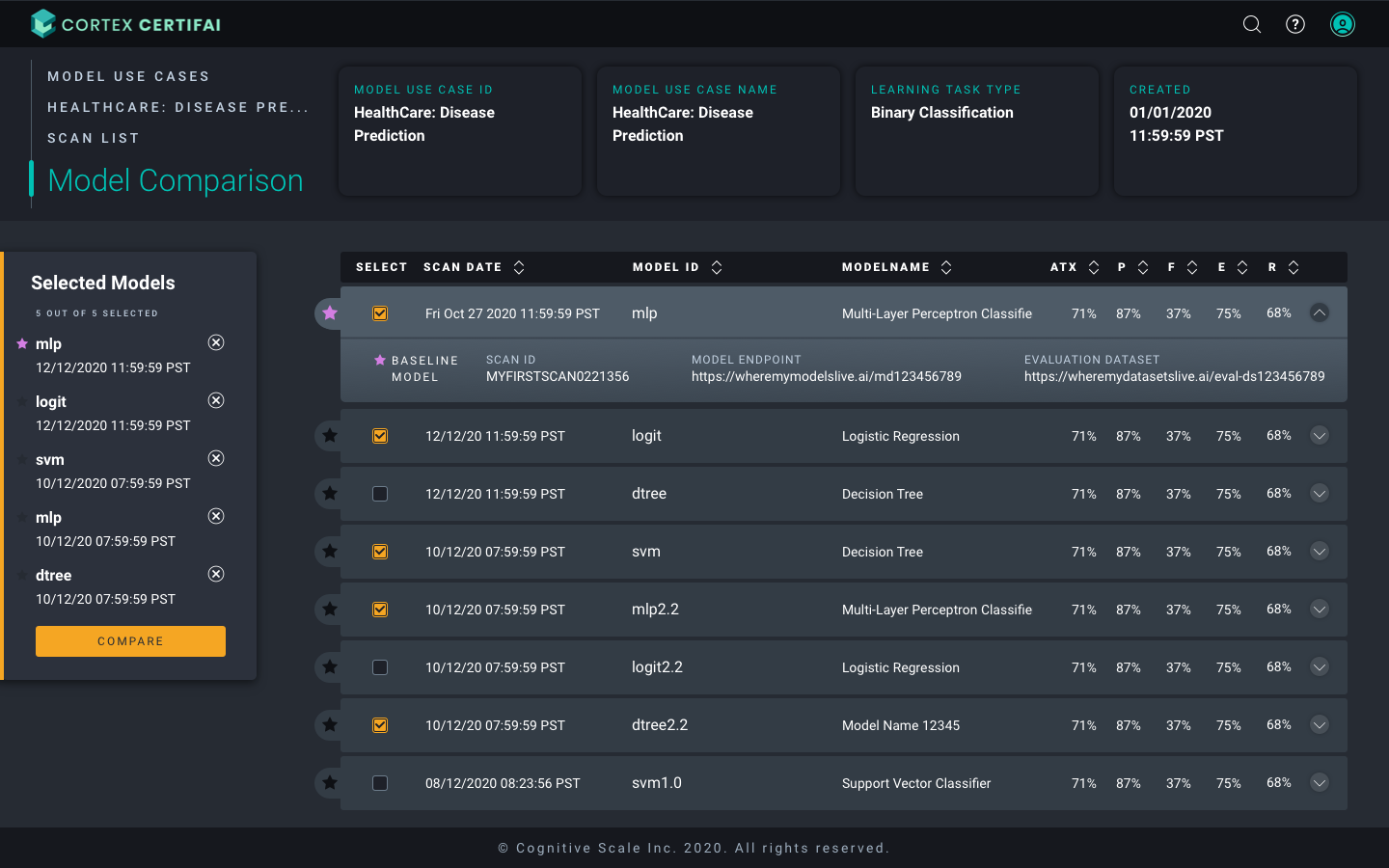
Every view carries a persistent header bar with the model use case ID, use case name, learning task type, and creation date — context that answers 'what am I looking at?' before the user reads a single data point. Left-side breadcrumb navigation keeps users oriented across a deeply nested workflow: Model Use Cases → Specific use case → Scan List → Model Comparison.
In a product where users might toggle between a dozen models across multiple scans, the orientation layer was not decorative — it was a tool to avoid confusion and to increase confidence.
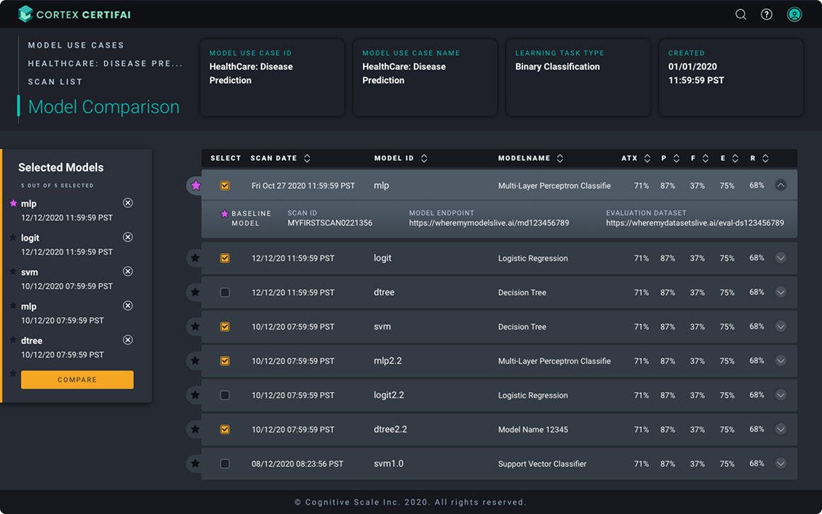
02 Model Comparison Table
The scan list and model comparison view surfaces the most operationally important signals at a glance: scan date, model ID, model name, and the five trust dimension scores (ATX, Performance, Fairness, Explainability, Robustness) with expandable rows that reveal deeper scan metadata. A left-panel sidebar lets data scientists select up to five models and surface a baseline, giving them agency over the analytical frame before committing to a view.
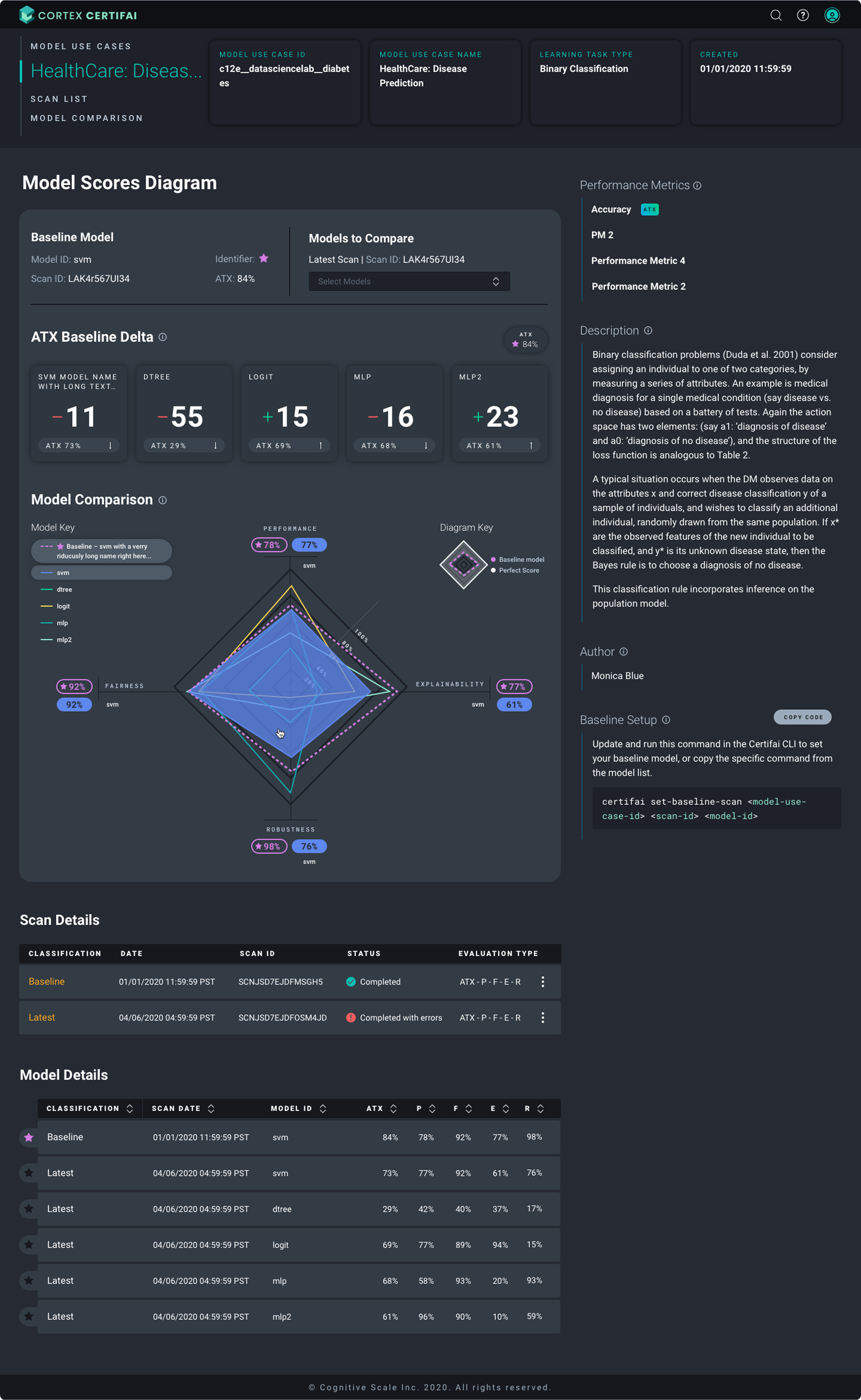
03 The Model Scores Diagram
The Story Behind the Screen
The CTO asked me to add an element that I had used in a different product to the model use case summary. The request did not make sense from a UX standpoint: adding an element for visual interest in that context would create noise without adding value. But rather than pushing back on the what, I asked him why. He explained he wanted a wow factor.
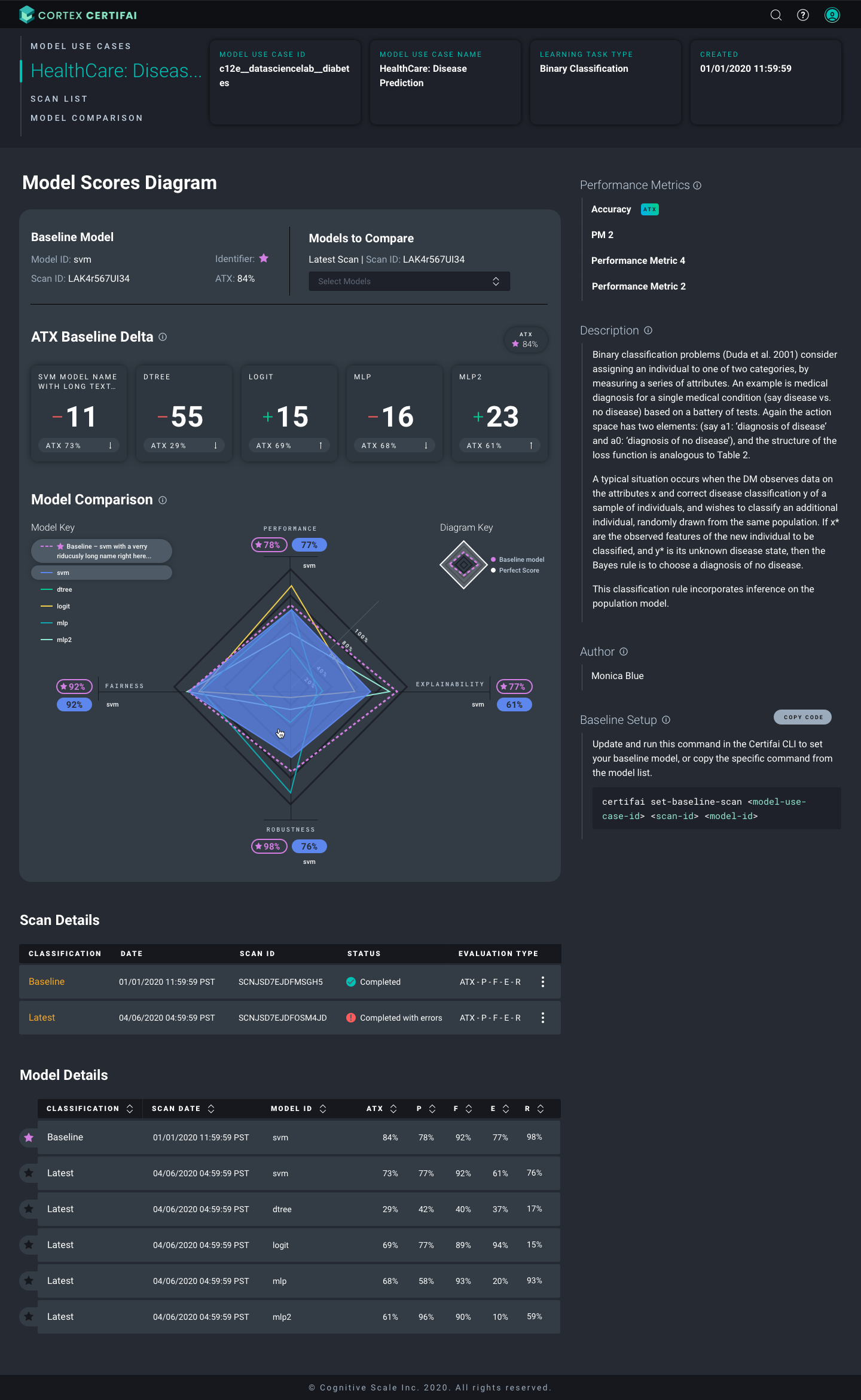
That reframe changed everything. The need was not a specific element in a specific place — the need was visual impact that made the product feel powerful and impressive. So instead of adding something decorative where it did not belong, I designed a radar chart for the Model Comparison section.
A multi-axis visualization plotting all four core trust dimensions (Performance, Fairness, Explainability, Robustness) simultaneously for every selected model, with overlapping colored polygons that make cross-model comparison instantaneous. It delivered the wow factor and delivered real analytical value. The CTO got what he actually needed. The users got a genuinely better tool. Neither required compromising the other.
ATX Baseline Delta
The ATX baseline allows us to compare at a glance the delta among the models compared to the baseline. In this example MDL-003 outperforms the base model by 23 points whereas MDL-002 falls short.
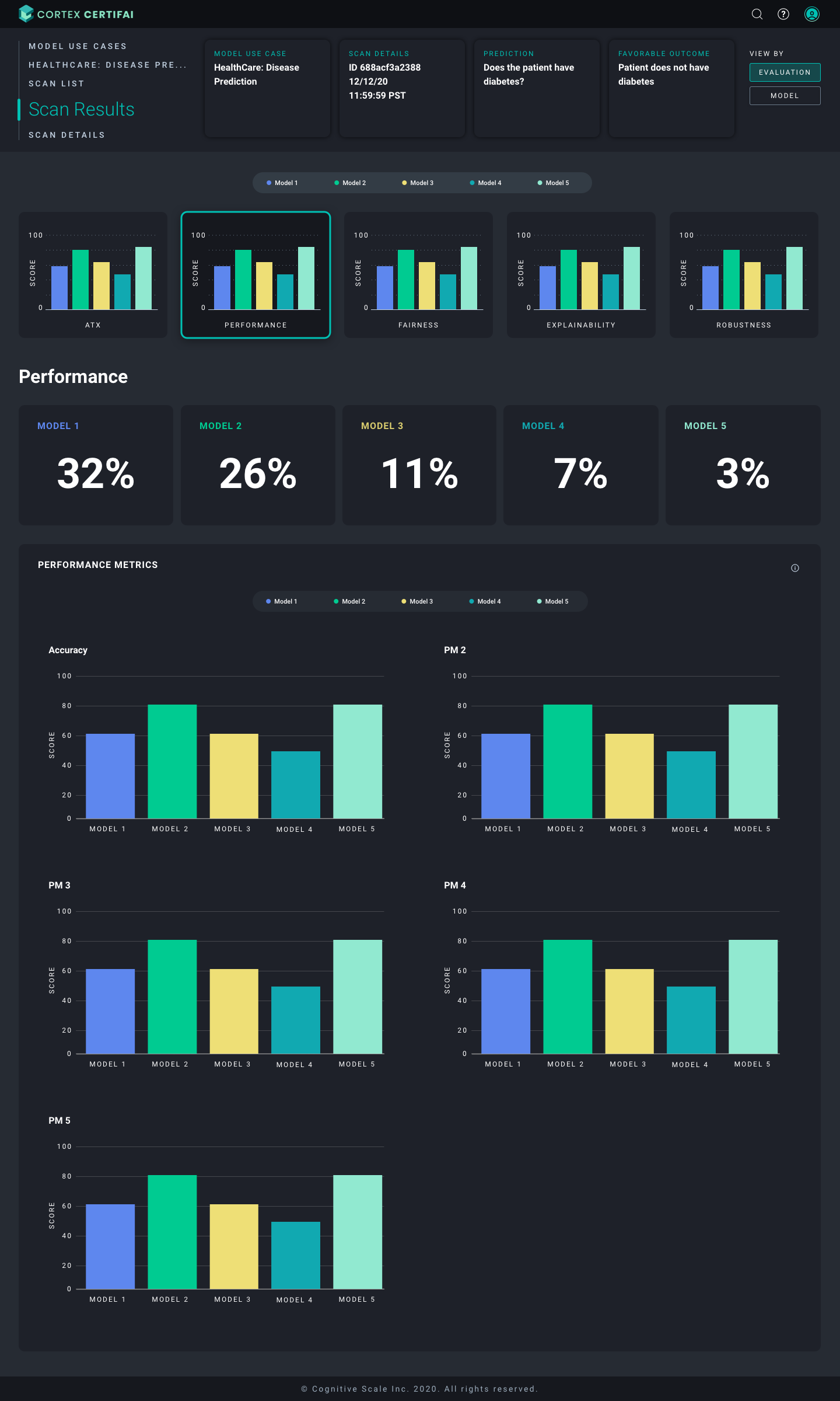
04 Scan Results
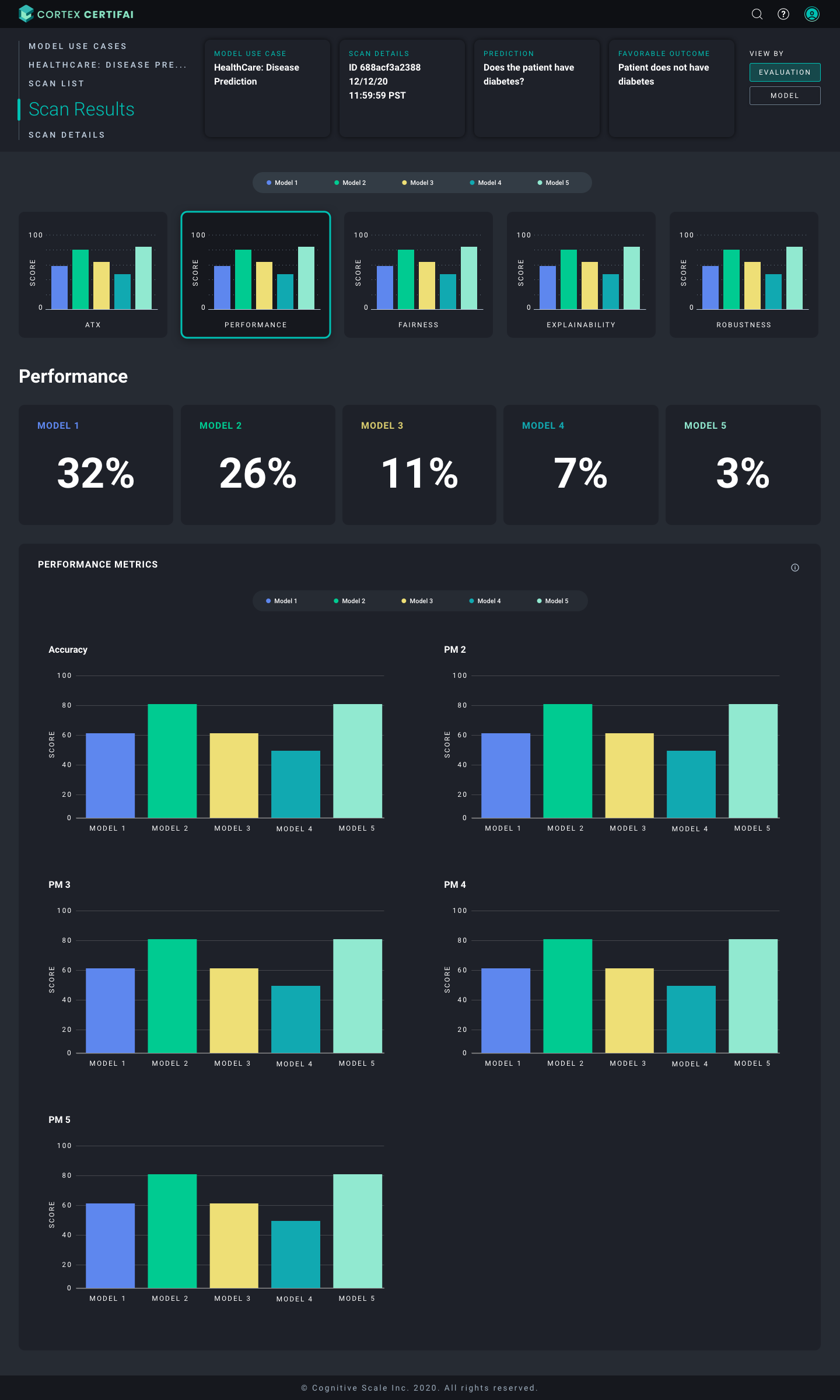
The scan results view shows dimension-by-dimension breakdowns across all selected models, with bar chart grids for each performance metric. A tab system lets users toggle between models, with color-coded identifiers that carry through every chart for visual consistency. Each trust dimension gets a summary card above the detailed metric grids letting users orient at macro level before drilling in.
What Made This Hard
The dark theme was a deliberate choice
Data scientists working with model comparison data often do so in environments where they're context-switching between terminals, notebooks, and dashboards. A dark theme reduces eye strain in that context and signals that this is a professional analytical tool, not a consumer dashboard. Every color choice — the teal for primary actions and positive signals, the yellow for caution states, the white score values — had to work against that dark background at the density the product required.
Scores that carry real stakes need to be honest
The AI Trust Index (ATX) is a composite score, but the four dimensions that compose it are not equally weighted for every use case. A healthcare disease prediction model has a different risk profile than a credit scoring model. The design had to make scores legible and scannable without suggesting false precision that the underlying methodology did not support. Contextual help, expandable descriptions, and careful labeling were part of how we handled this. We had to give users a path to deeper understanding without cluttering the primary view.
Recognition
SXSW Innovation Awards 2020
Finalist — Best AI Product
Global AI Achievement Awards 2019
Winner — Responsible AI & Ethics
Deployed with
Available on
Reflection
The most important skill I developed on Certifai was learning to hear what a stakeholder actually needs underneath what they're asking for. When the CTO said 'add something to make it pop,' the wrong response was to either comply literally or refuse. The right response was to understand the underlying need and find a way to meet it that made the product better, not just different.
Key Insight
In a product whose entire purpose is making complex systems legible and trustworthy, the instinct to translate rather than just execute turned out to matter a lot.
The radar chart was the response to 'wow factor.' The underlying methodology review was the response to 'make it pop.' Both were the same conversation — just heard correctly.