Cashflow Verification: Snapshot
ContentSquare analytics and moderated/unmoderated usability testing to diagnose why Snapshot adoption was stalling. Reframed $621M fallout — not a trust problem, but a design problem with 6 failure points and 6 direct fixes.
Overview
When customers apply for a Discover Personal Loan and get flagged for verification, one path available to them is cashflow verification. They could prove their financial health by either uploading bank statements manually or connecting their bank account automatically through Snapshot, a third-party integration.
Snapshot should be faster, less manual, with no document hunting. Over half of customers who were eligible weren't even trying it. Of those who did, most didn't finish. The question was why.
| Metric | Number |
|---|---|
| Total triggered for verification | $3.38B |
| Triggered for cashflow specifically | $887M |
| Customers who attempt Snapshot | 47% |
| Customers who complete Snapshot | 23% |
| Customers cashflow approved | 5.2% |
| Cashflow fallout | $621M |
Research Approach
I led research design and execution across three methods, deliberately combining quantitative behavioral data with qualitative insight to understand not just where the experience was breaking down, but why.
Watching real users move through the existing experience surfaced behavioral patterns that survey data can't capture: where people hesitated, what they clicked first, where they got stuck and tried again, and where they gave up entirely.
Five participants went through a white-labeled Snapshot experience; five went through a white-labeled Nova Credit experience. Moderating allowed me to ask follow-up questions in the moment, probing the why behind behaviors that session replay could only show me.
Comparing Snapshot and Nova Credit at scale, without moderator influence, to validate whether the patterns from moderated testing held up across a broader sample.
What We Found
Category 1 — Usability Failures
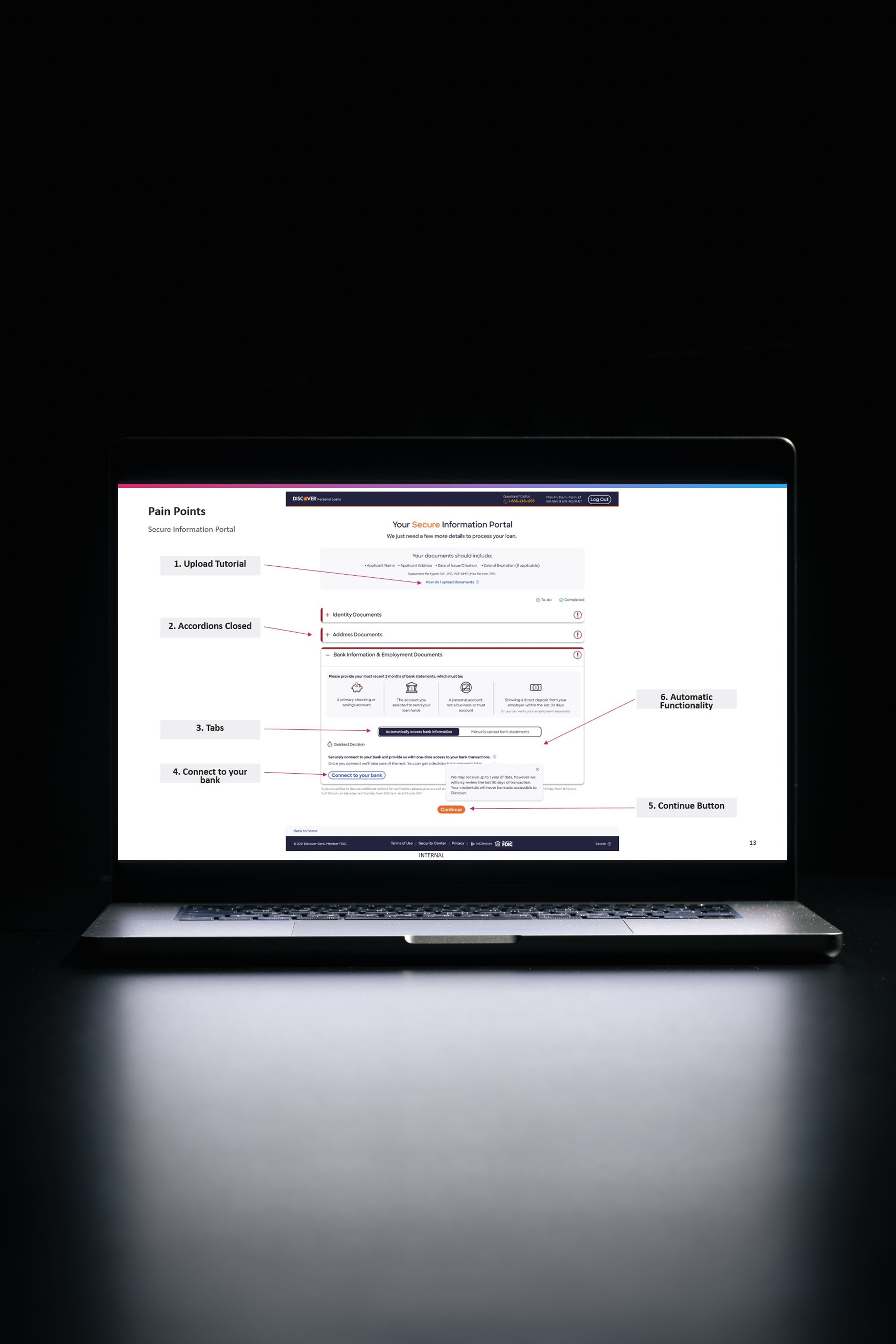
The interface presented two options using a tab pattern. But the tabs read as primary action buttons, not navigation controls. 40% of moderated participants clicked the 'Automatically access bank information' tab expecting it to do something, not realizing it was already selected. The actual CTA 'Connect to your bank' was visually subordinate to the thing users were already clicking.
I thought that by clicking on the "Automatically access bank information" tab, it would start the process
– Moderated test participant
Despite 50% of participants saying they'd prefer the automatic path, 2 moderated participants couldn't find the button to initiate it. The visual hierarchy made the tab feel like the action and the button feel like a detail.
Users who were confused about where to start eventually found the tutorial link and then tried to upload their documents directly from the tutorial popup. The tutorial wasn't labeled or designed in a way that made its instructional purpose clear, and it didn't always reflect what users were seeing on their specific device or accordion state.
The interface organized tasks into accordions. With all collapsed on load, particularly users on mobile didn't know where to begin. Four of the five mobile users' first click wasn't an accordion. The interface provided no signal about what action to take first.
The Continue button appeared regardless of task completion status. If users clicked it before finishing, it routed them to an unexpected screen with little context for the user to recover. 2 moderated users were confused by the button being present and active during incomplete states, leading to frustrating dead ends.
Of the 17 users who attempted to connect their bank accounts, only 3 connected successfully. 3 got connection errors. 10 abandoned after failed attempts. The design was bearing the cost of a technical reliability problem. Users who would have successfully connected in a working system were reading technical failure as a reason not to trust the process at all.
Category 2 — The Trust Problem
8 of 10 moderated participants explicitly raised data security as a concern. Many had direct references to recent data breaches. Several said their willingness to connect automatically depended on whether they already had a relationship with the bank they were connecting.
It would be nice to have some sort of reassurance that the bank doesn't have access to my account other than for this specific purpose.
– Unmoderated test participant
It took me a second to realize I was actually sharing my bank info with Equifax and not [the bank I was logging into]. That took a second to realize what was happening.
– Unmoderated test participant
The third-party nature of Snapshot — connecting your bank routes you through Equifax rather than Discover directly — was producing a trust gap users weren't prepared for. The existing interface didn't reassure users the connection was one-time, and didn't reinforce that their data was encrypted or what specifically it would be used for.
The Recommendations
Restructure the visual hierarchy so the automatic path reads as the recommended, easy option with manual upload available as a fallback. This aligns the interface with what users actually want to do.
The tab treatment was causing action confusion. A pattern that makes the choice explicit and separates the selection from the call-to-action. Removing the ambiguity that was sending users in circles.
Remove the blank-slate problem. When users land on the page, the first task is already surfaced and ready to begin. Progress through the flow is visible and guided.
A button that routes users to an unexpected screen when clicked prematurely is a trust-eroding experience. Disabling it until required tasks are done eliminates a frustrating dead end without removing the button's presence from the interface.
At the point where users are asked to connect their accounts, the interface should confirm the connection is made through a trusted third party, state explicitly that it's a one-time link, and reassure users their credentials are encrypted and used only for this purpose. These aren't disclaimers buried in a disclosure — they should be part of the primary UI.
Rename it to make clear it's instructional. Add enough context that users understand they cannot upload from the tutorial window. Ensure the tutorial accurately reflects what users see on their specific device and accordion state.
Impact
was not primarily a trust problem. It was a design problem sitting on top of a technical reliability problem, with a trust layer the design had never actively addressed.
The prevailing assumption was that users were resistant to Snapshot because they didn't trust automatic bank connections. The research showed something more specific: users were willing — the interface wasn't giving them a reason to follow through.
Design friction. Technical reliability. Trust gap. Three separate problems, each with a distinct solution path. The research made it possible to address them separately rather than treating $621M in fallout as a single undifferentiated problem.
Reflection
The most valuable outcome was reframing what kind of problem we were solving. Coming in, the team suspected trust was the barrier. Leaving, we understood that trust was a barrier the design had never attempted to address, technical reliability was quietly undermining an otherwise willing user base, and the interface was working against users who already wanted to do the right thing.
When the design is in the way of user intent, the solution is to get out of the way.
The $621M wasn't lost because customers didn't want to automatically verify their income. It was lost because the experience made verification feel riskier than it was, harder than it needed to be, and less trustworthy than the underlying product actually was.