Payments Risk & Compliance Management System
PRCMS Redesign
Payments Risk & Compliance Management System
Overview
PRCMS is Discover's internal platform for payments risk and compliance case management. Investigators use it daily to review flagged transactions, work cases through their full lifecycle, from entity review to escalation to closure, and document their findings along the way.
The existing platform had accumulated years of friction. Investigators were navigating three tabs before they could take action on a case. Important information was buried. Escalations required leaving the system entirely. Notes, attachments, and case history were scattered rather than contextual. And the homepage gave no intuitive signal about where to focus first.
The redesign addressed two interconnected surfaces: the homepage (case queue management) and the case detail page (the investigation workflow itself).
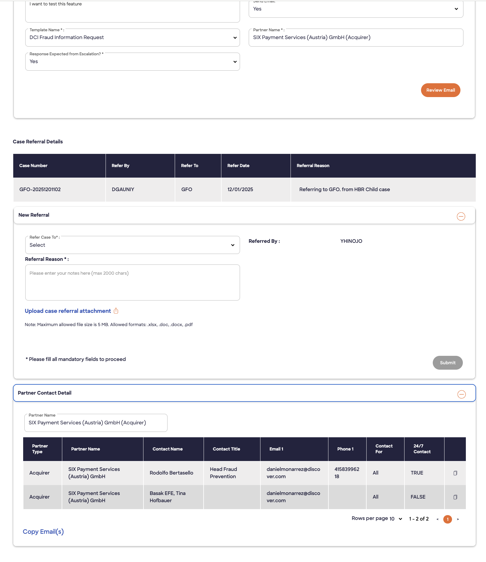
Original Design
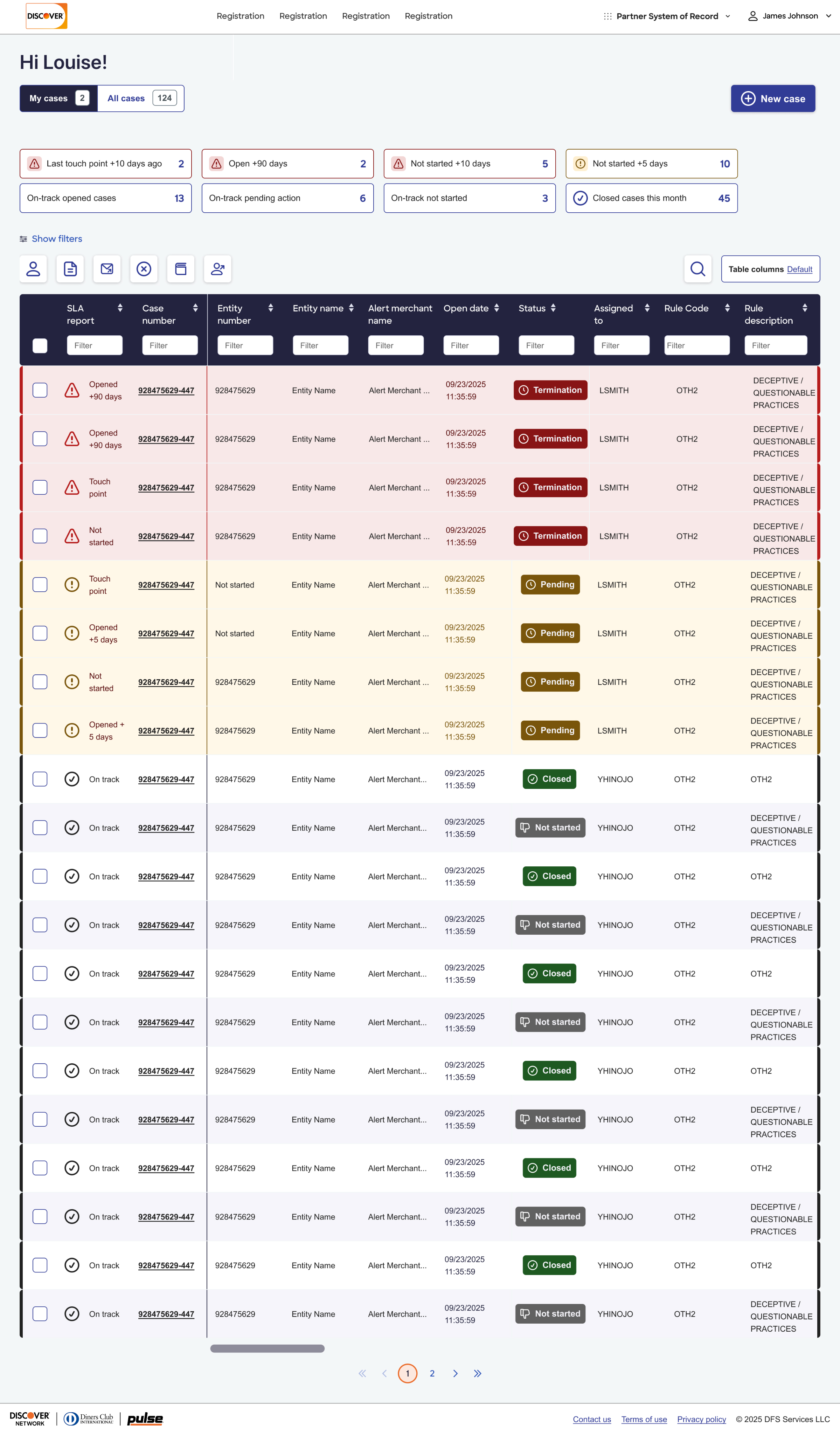
Re-Design
Research & Testing Approach
I built and tested an interactive prototype with 6 PRCMS users across experience levels, from power users to investigators newer to the platform. Participants worked through the key tasks and provided real-time feedback on the designs and flows. That feedback drove direct iteration.
Full Platform Redesign Scope
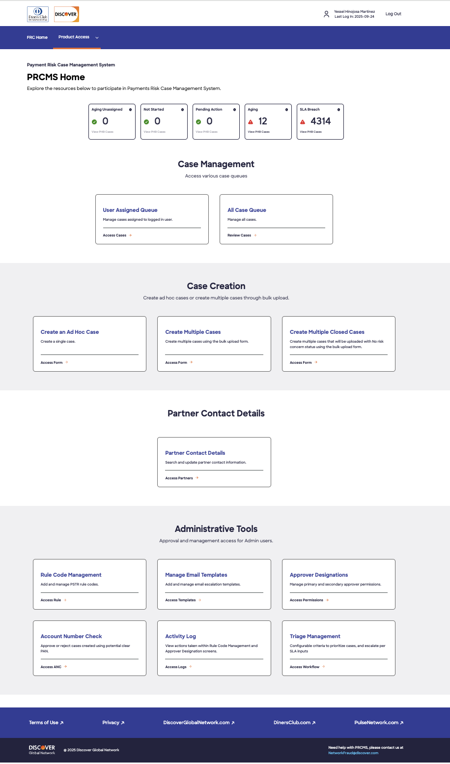
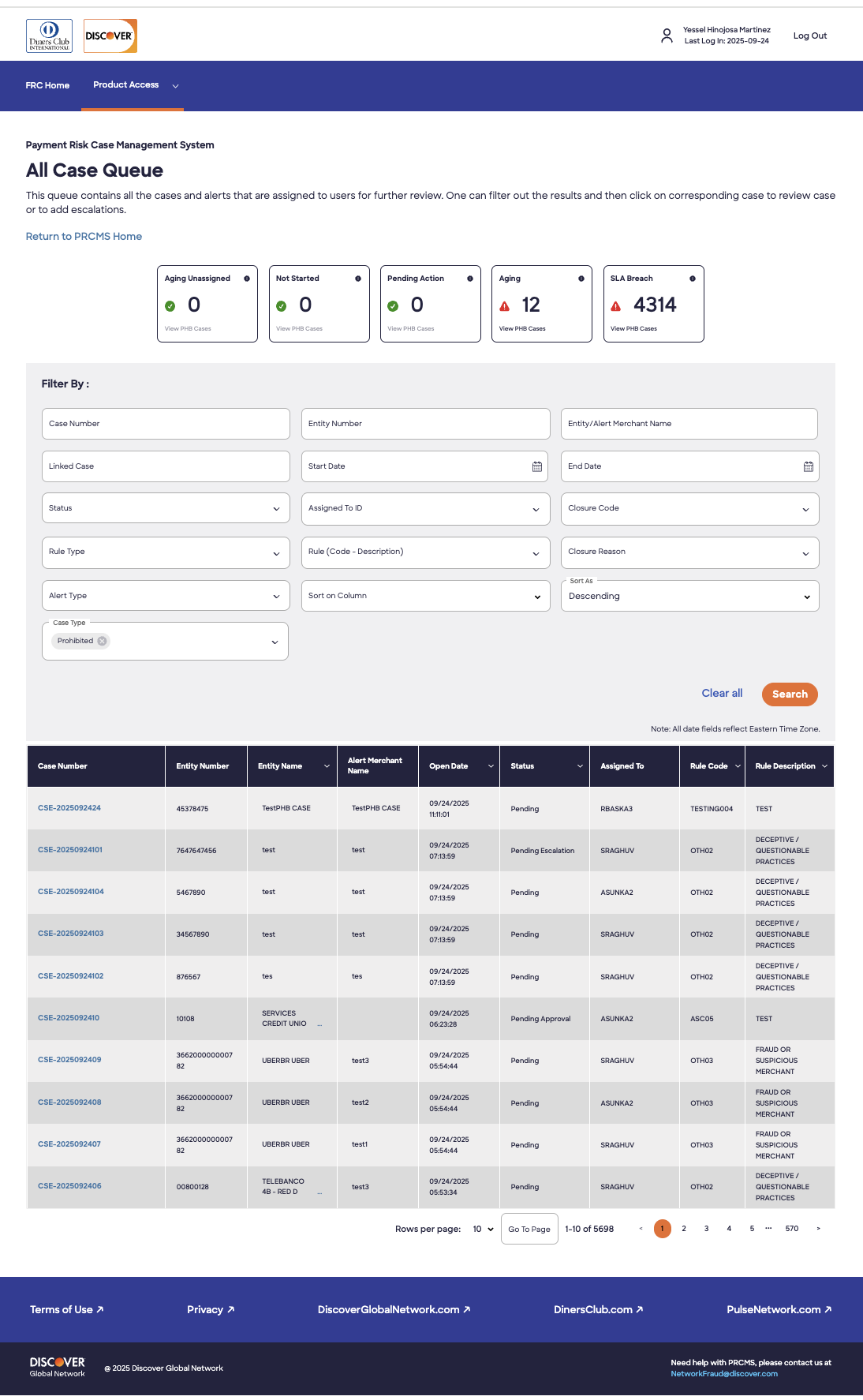
What Wasn't Working
They opened the queue and manually sorted through cases to figure out what needed attention first. There was no visual urgency system, no at-a-glance SLA status, and no way to act on multiple cases at once without navigating away.
What We Designed
Color-coded SLA metrics as the priority layer
The redesigned homepage leads with granular SLA status; cases broken down by breach type, color-coded for instant urgency identification. These metrics are not decorative: clicking them filters the table. Investigators can go from opening the app to working the highest-priority case in seconds.
My Cases / All Cases toggle
A persistent toggle lets investigators switch between their own queue and the full team's cases without navigating back to the homepage. A simple change that eliminated a round-trip dozens of times per day.
New case from anywhere
Investigators can create a new case directly from the homepage or from the global navigation, without losing their current context. A dropdown distinguishes between single and multiple case creation.
Table built for real investigative work
The table was redesigned with investigators' actual data needs in mind: default sort by urgency, column reordering and selection, horizontal scroll for wide data sets, a search bar, and a copy affordance for case and merchant IDs. Users can save their custom column configuration.
Bulk actions that work
Bulk reassignment and escalation were added with the ability to add notes and closure codes during bulk operations, which users had flagged as a critical missing piece.

What Users Said
I like it right off the bat. I love the SLA boxes and the metrics — these buckets are very helpful. The design enhancements will help us focus on the work.
— Usability Testing Participant
Color coordination is a game changer for urgency.
— Usability Testing Participant
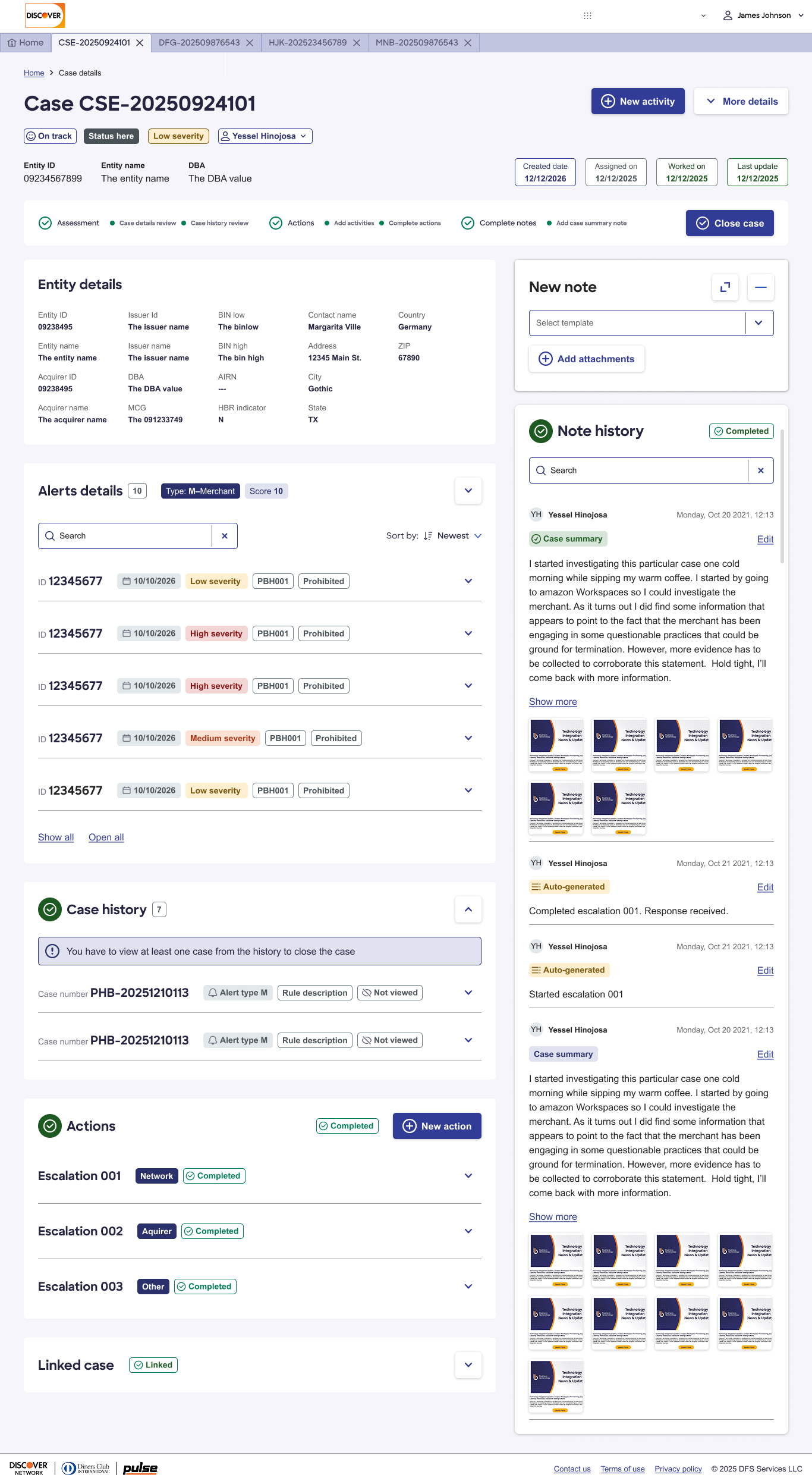
The Investigation Workflow
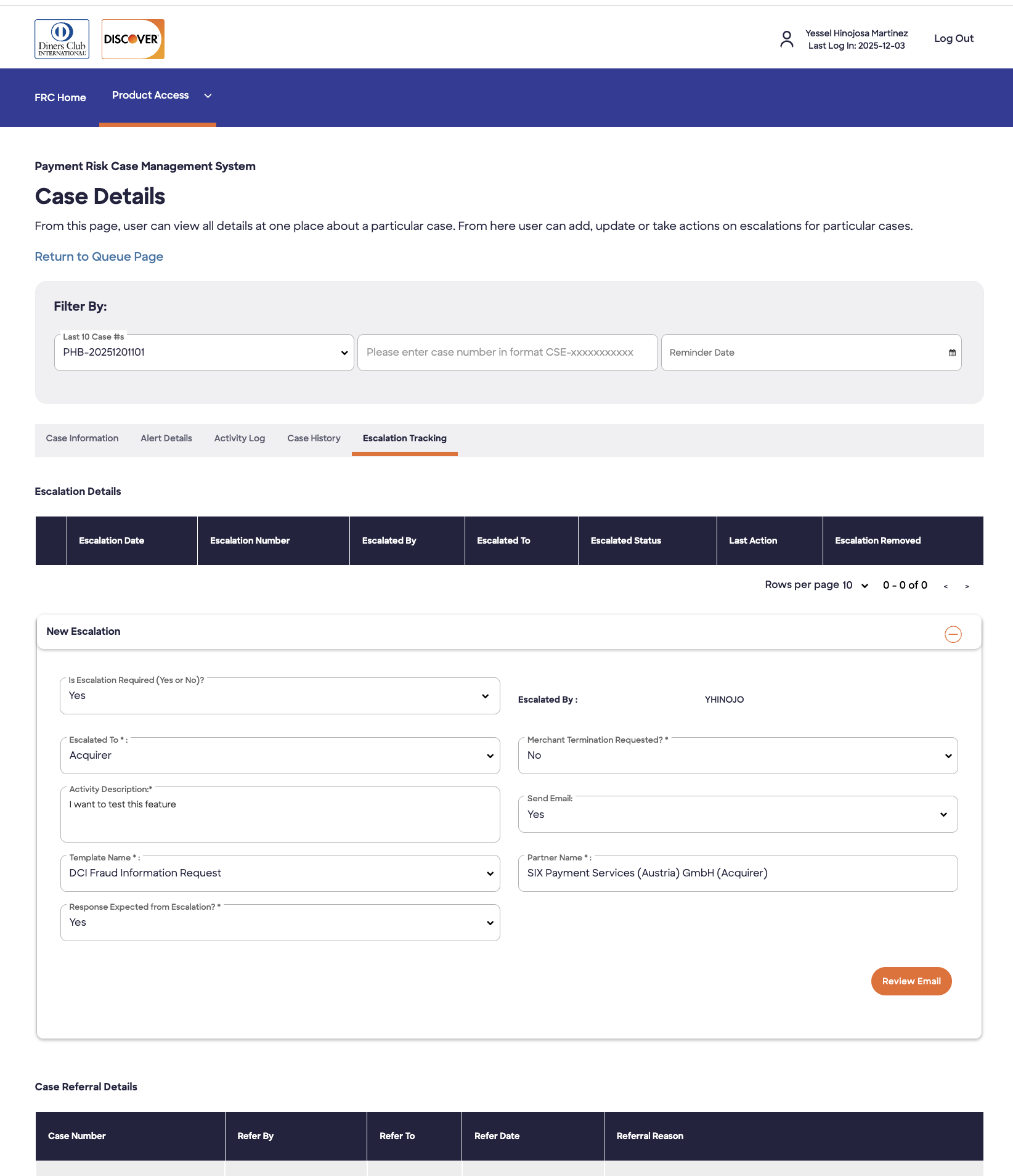
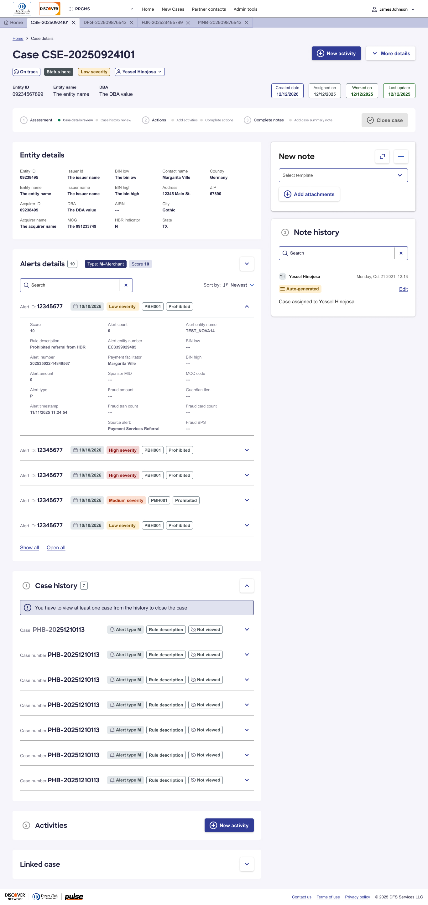
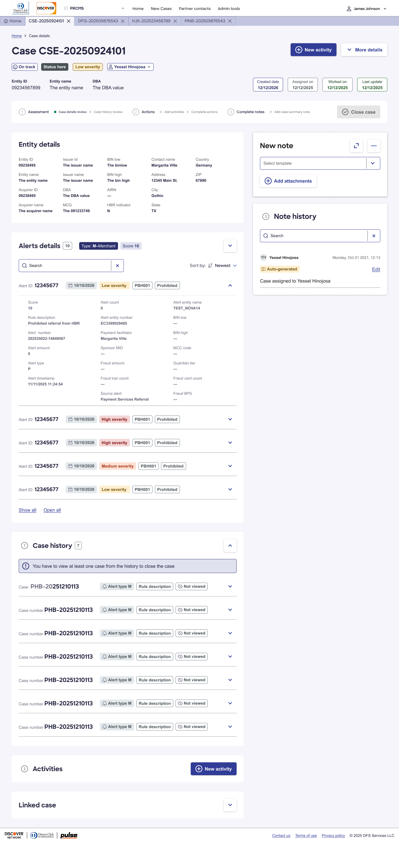
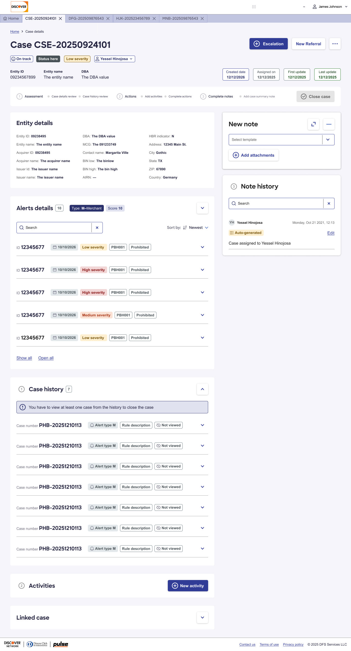
The existing design forced investigators through three tabs before they could take meaningful action. Critical information was scattered. There was no guided path through the case lifecycle. Escalations required leaving PRCMS entirely, then manually documenting that they had happened.
Redesign philosophy: the page should reflect the natural progression of how investigators actually work a case. Information should appear in the order it is needed. Actions should be available exactly when they become relevant. Completion should be visible and rewarding.
Elevated Case Hierarchy
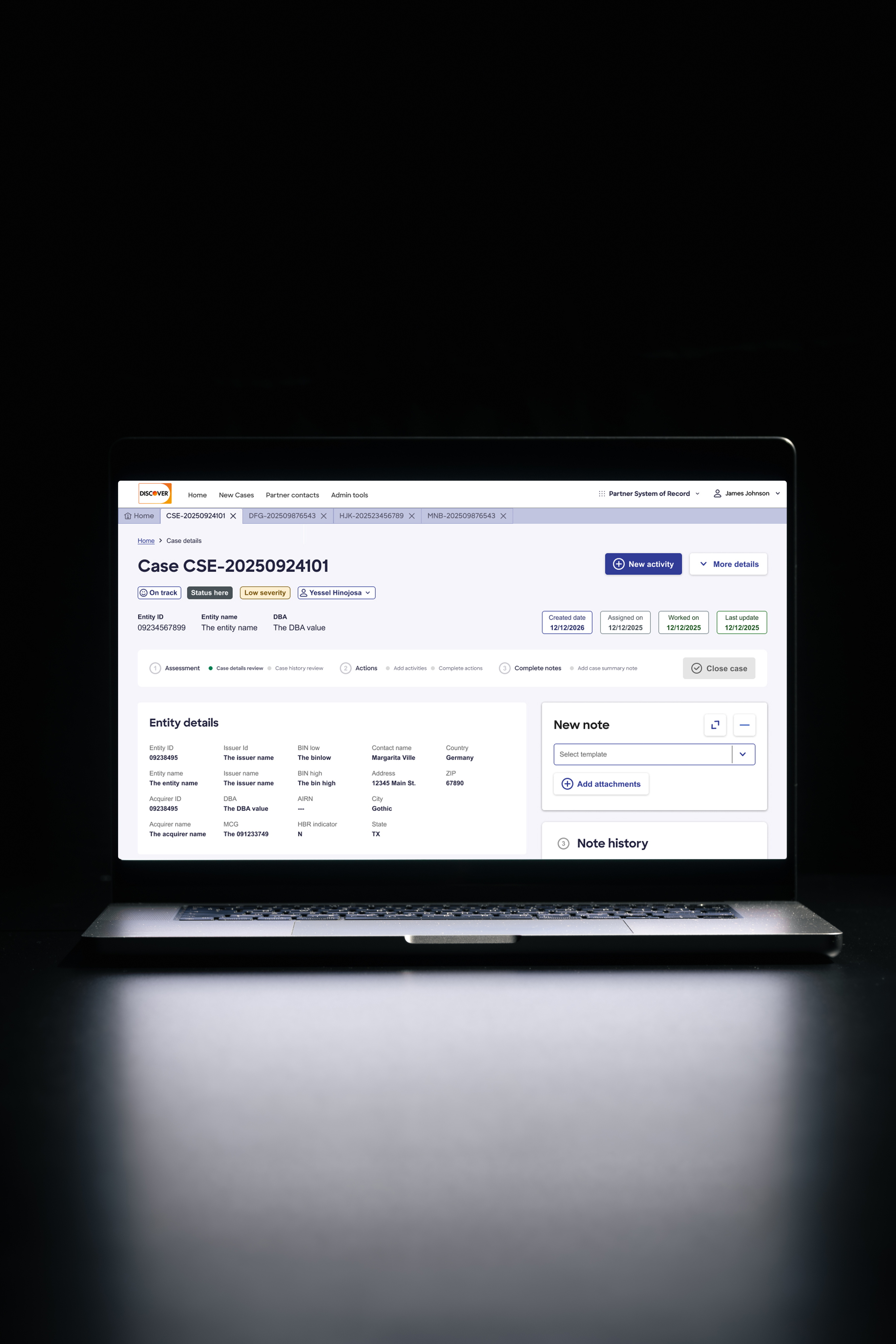
The top section of the redesigned case detail surfaces everything an investigator needs to understand the case and decide what to do next. Left column (top to bottom): case number, SLA and case status, case severity, assigned investigator, entity ID and name. Right column: primary action buttons and key dates. Investigators arrive at a case already oriented and not hunting for context.
Left Column
Right Column
Guided Workflow: The Stepper
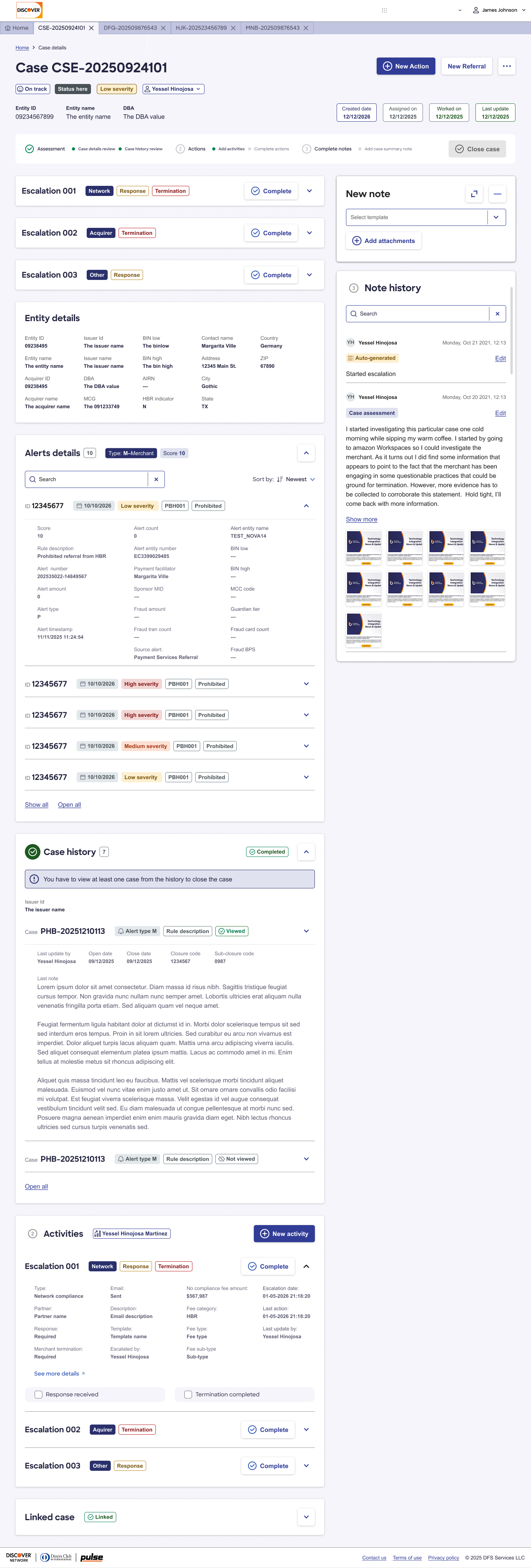
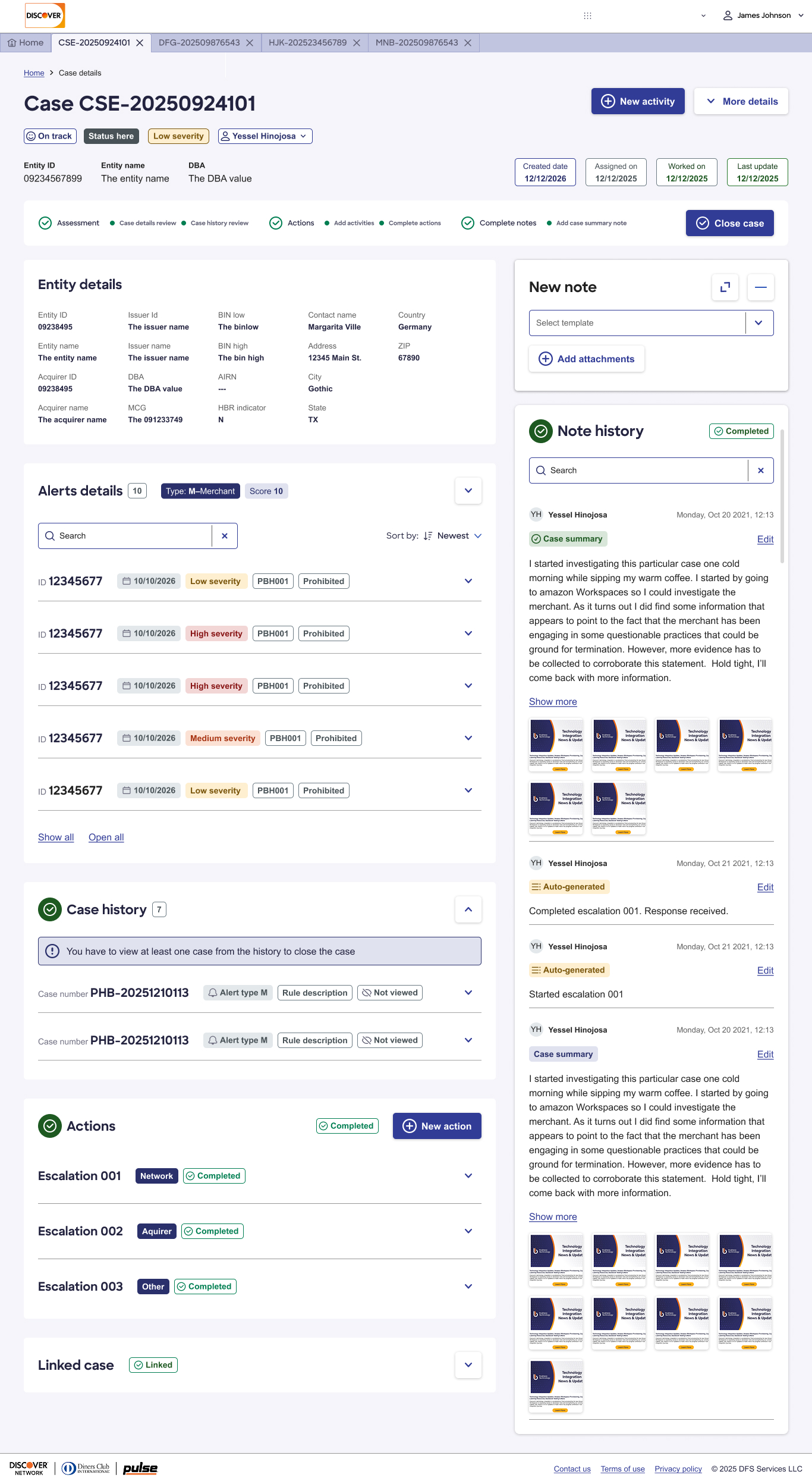
A visual stepper maps the three required actions to close a case. Steps highlight as completed. The Close Case button stays disabled until all three are done. This is the most significant structural change, turning an implicit, error-prone process into an explicit, guided one.
With the current design I have to go through three tabs before doing anything. This design feels more organized.
— Usability Testing Participant
Notes: Contextual, Templated, Searchable
The notes panel runs alongside the case content — so investigators can read entity details, alerts, or case history while writing. This parallel layout was a deliberate response to a common workflow where investigators had been copying information between tabs to write their notes.
New Note Features
Note History
Design System Alignment
All designs were built with Discover Radiant Design System components in mind. Where Radiant components had been adapted or extended, those changes were flagged as suggestions to the design system team — treating the PRCMS redesign as a signal for system-level updates, not just a one-off implementation.
What Users Said — Across Both Surfaces
Results
Task completion
Task completion time improved across the primary case management and escalation workflows
SLA identification
SLA breach identification became immediate rather than requiring manual sort
Escalation
Escalation process moved entirely in-system, eliminating external handoffs and manual documentation
Case closure
Case closure integrity improved through guided steps and system-enforced completion requirements
Satisfaction
High across all six test participants, with no major usability failures in the final prototype
Reflection
PRCMS is the kind of project where the design problems are invisible from the outside because investigators had adapted to the friction so thoroughly that some of it had stopped feeling like friction. The work of this redesign was partly about identifying what people had stopped complaining about because they had accepted it.
The guided stepper is a good example. The idea that a system should tell you what to do next — and confirm when you have done it — seems obvious in retrospect. But it required understanding the investigation lifecycle well enough to know that the current steps were being skipped, in what order, and with what downstream consequences.
With the current design, I have to go through three tabs before doing anything.
She had been doing that every day. She had stopped noticing. The redesign gave them that time back.